How to Choose a Font
A style guide for making typography look intentional, expensive, and perfectly on-brief
A style guide for making typography look intentional, expensive, and perfectly on-brief
Fonts are the quiet power move of design. You can have the best photography, the cleanest layout, and the smartest copy, but if the type is wrong, the entire project reads as “almost.” The right font does not just look good. It sets the price point, the mood, the credibility, and the era, all before anyone reads a single word.
Here is how to choose a font the way editors, brand directors, and luxury designers do it: with taste, restraint, and a few rules that never fail.
Before you open a font library, decide what room you are walking into.
Ask yourself three questions:
Who is this for, and what do they expect to feel
Where will it live, and how will it be read
What is the single outcome you want from the viewer
A fragrance campaign, a fintech landing page, and an art book cover cannot share the same typographic logic. Typography is context. The project tells you what to pick.
A good font choice begins as a mood, not a feature list. Choose one primary tone:
Quiet luxury
Editorial
Modern minimal
Craft and heritage
Tech and precision
Romantic
Playful
Brutalist
Youthful street
Once you have the tone, the category becomes obvious.
You do not need to memorise typography history. You just need to know what people feel when they see a shape.
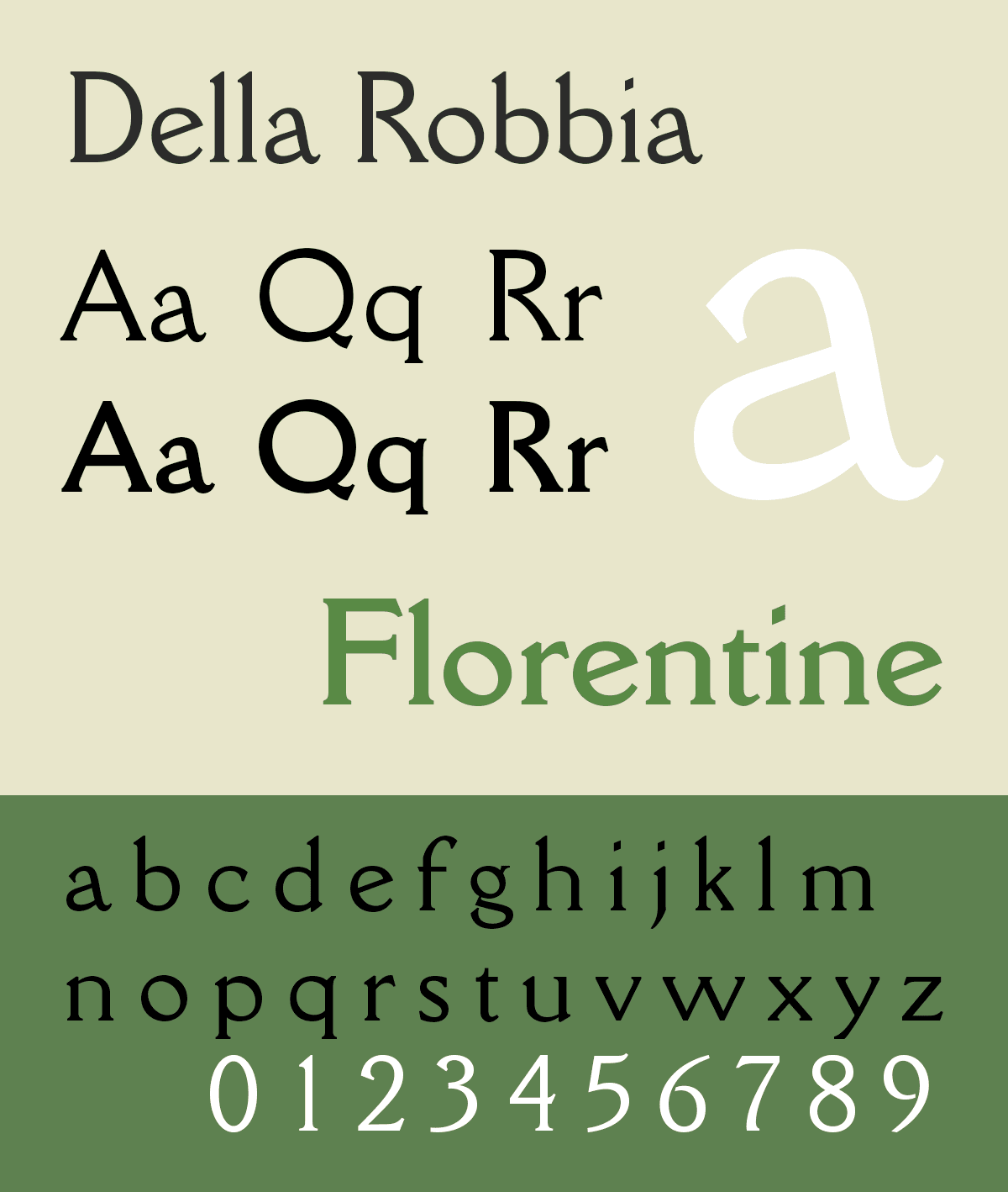
Serifs feel established. They suggest heritage, taste, and culture. In the right setting, a serif is the equivalent of a tailored coat. Not loud, just correct.
Best for: luxury, editorial, hospitality, finance, high-end product pages
Avoid when: you need ultra-clean UI clarity, or when the serif is too delicate for small sizes
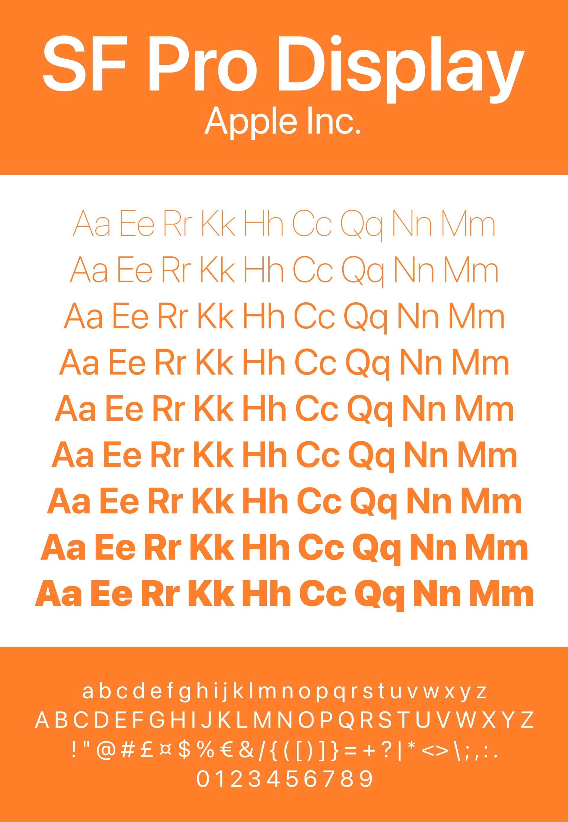
Sans feels modern and confident. It is clean, legible, and fast, especially on screens. A good sans can look premium too, but it does it through restraint.
Best for: tech, modern brands, e-commerce, apps, dashboards, minimal identities
Avoid when: it looks like a default template and brings no personality
Script is emotional. It can feel romantic, artisanal, and luxurious, but only when used with discipline. Script is not for explaining. Script is for signing.
Best for: accents, short headlines, logos, packaging details, invitations, beauty and fashion moments
Avoid when: it becomes the body text, or when it looks like a generic wedding font
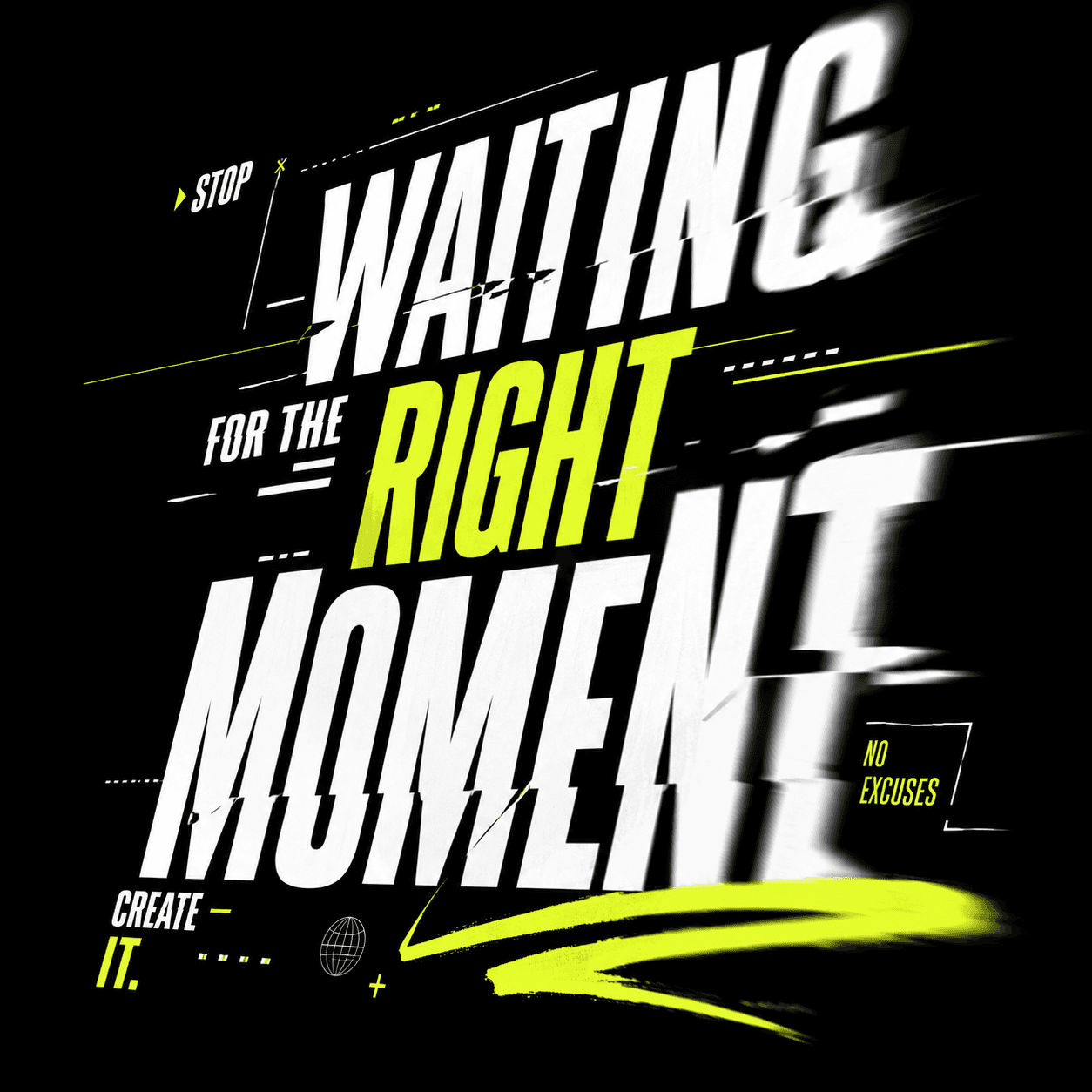
Display fonts are made to be seen. They are designed for headlines and campaign moments. Used well, they create identity instantly.
Best for: posters, hero sections, drops, editorial covers, campaigns, social graphics
Avoid when: you try to use them for long reading or UI labels
Monospace feels technical and intentional. It signals systems, code, engineering, and sometimes a retro digital mood.
Best for: tech brands, product interfaces, experimental editorial, niche aesthetics
Avoid when: you want warmth, softness, or mass-market appeal