10 Typography Mistakes That Make Your Brand Look Cheap (Fix Them)
Avoid the typography mistakes that instantly make a website look unprofessional. Learn simple fixes and compare fonts using FindFont.co.

Avoid the typography mistakes that instantly make a website look unprofessional. Learn simple fixes and compare fonts using FindFont.co.
You can have a great logo, a clean website, even a good product…
But if your typography is wrong, your brand will still look cheap.
Typography is one of the biggest “trust signals” in design. It silently tells people whether you’re a serious business, a premium brand, or a random website that nobody should trust with their money.
If your site feels off and you cannot explain why, it’s often typography.
Let’s fix it.
Below are 10 common typography mistakes that make brands look unprofessional, plus the exact design fixes you can apply today.
If your website uses 3–6 fonts, your brand instantly feels messy.
Why it looks cheap:
People associate inconsistent typography with low attention to detail.
Fix:
Use 2 fonts max:
1 font for headings
1 font for body text
If you really need variety, use different weights (Regular, Medium, Bold) instead of adding more fonts.
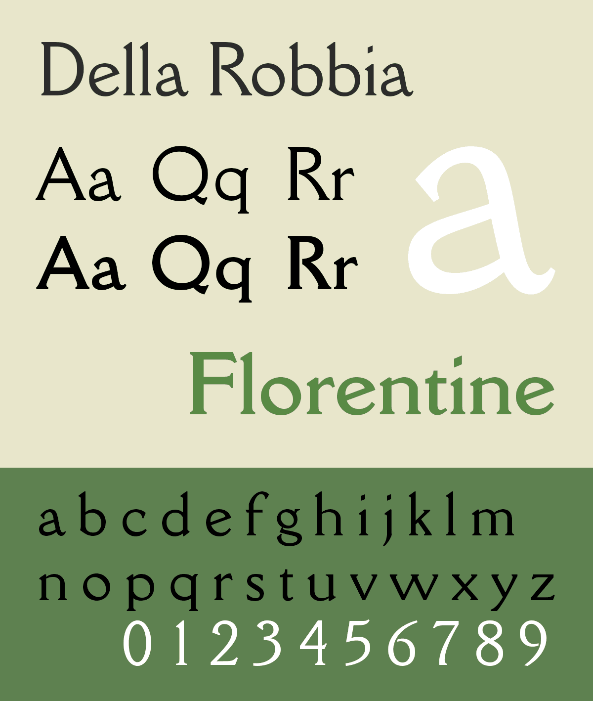
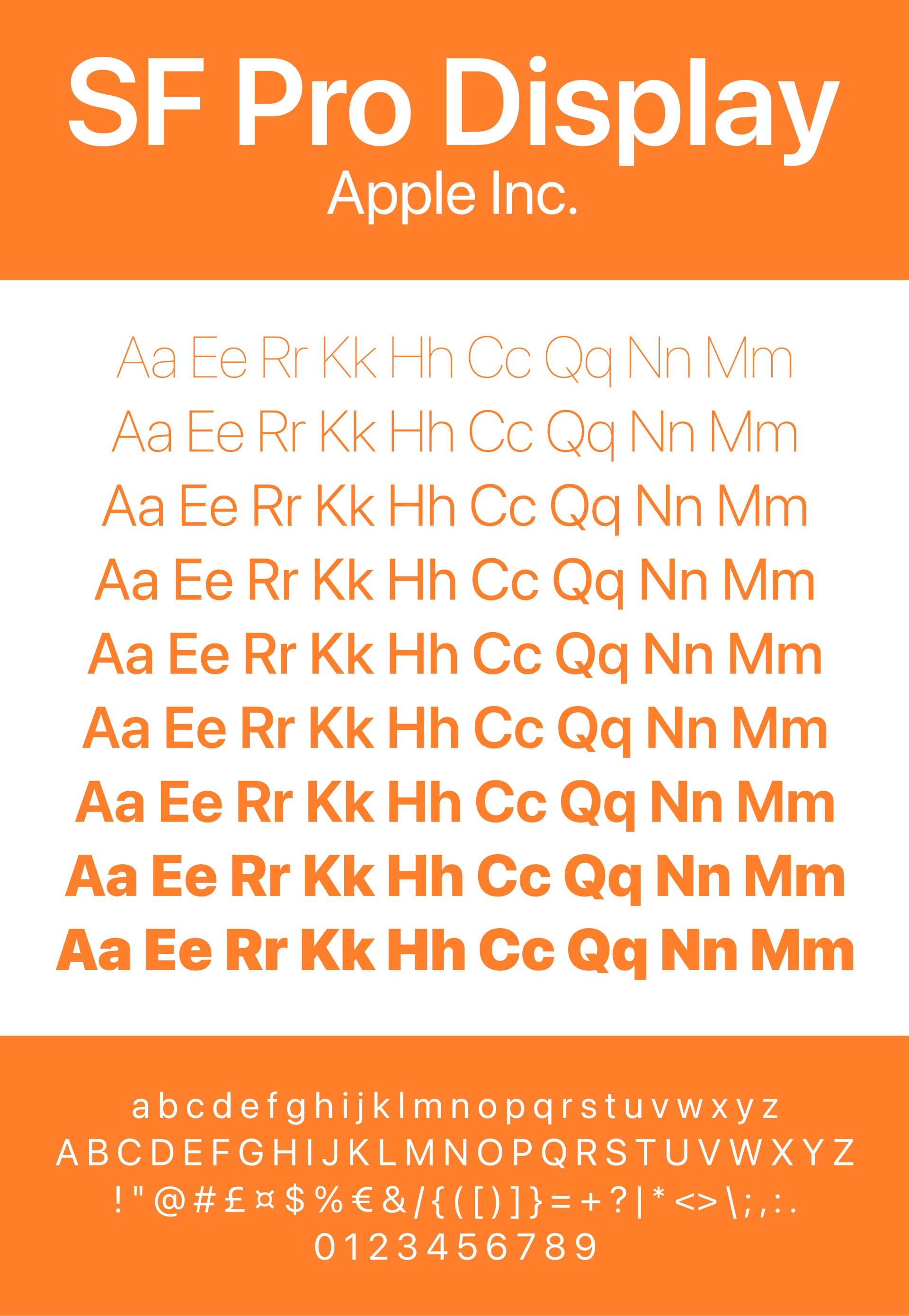
✅ Pro workflow: shortlist fonts and compare them side by side using FindFont.co, so you pick a system faster without guessing.
A futuristic tech startup using a romantic handwritten script font will confuse people instantly.
Why it looks cheap:
The typography “tone” does not match the brand message.
Fix:
Pick 3 brand words first:
Examples:
Modern, clean, confident
Luxury, timeless, elegant
Bold, edgy, rebellious
Friendly, playful, warm
Then choose fonts that match those words.
This is a huge one. Even “good fonts” can look terrible with wrong spacing.
Why it looks cheap:
Your site starts to feel like a low-quality template.
Fix:
Use these safe defaults:
Body line-height: 1.5 to 1.8
Headings line-height: 1.1 to 1.25
If your text feels cramped, increase line height.
If your headlines look too loose, reduce it slightly.
Many websites make everything Regular or everything Bold.
Why it looks cheap:
No visual structure, no hierarchy.
Fix (simple rule):
Body: Regular (400)
Subtitles: Medium (500)
Headings: SemiBold (600) or Bold (700)
Typography should guide the eye naturally.
If your titles, subtitles, and paragraphs all look similar, the page becomes boring and hard to scan.
Why it looks cheap:
It feels like a document, not a designed experience.
Fix:
Use a clear size structure like this:
H1: 44–64px
H2: 28–36px
H3: 20–24px
Body: 16–18px
Caption: 12–14px
Your visitor should instantly understand what matters most.
Center text looks “aesthetic”… until it becomes unreadable.
Why it looks cheap:
It feels like an Instagram quote page, not a professional brand.
Fix:
Center-align only:
short headlines
small CTAs
hero statements under 2 lines
For body text, always left-align.
All caps can look premium when used carefully, but most people overuse it.
Why it looks cheap:
All caps reduces readability, feels aggressive, and makes everything look like a label.
Fix:
Use all caps only for:
small navigation items
small section labels
tags like “NEW”, “LIMITED”
And add slight letter spacing:
letter-spacing: 0.04em to 0.08em
This is a silent killer.
Sometimes a font looks “weird” not because it’s a bad font, but because spacing is wrong.
Why it looks cheap:
Text feels randomly stretched, compressed, or awkward.
Fix:
Body text: letter-spacing 0 (default)
Large bold headlines: tighten slightly (example: -0.02em)
Small caps: increase slightly (example: 0.06em)
Tiny changes make massive difference.
A font can look amazing when you see “ABCDEFGHIJKLMNOPQRSTUVWXYZ”…
…but awful in real UI.
Why it looks cheap:
Because it fails in real content:
buttons
prices
paragraphs
mobile views
Fix:
Always test fonts in real use cases:
Try this sample:
Headline:
“Build your brand with confidence.”
Body:
“Typography affects how people trust your product, how long they stay on your site, and whether they buy.”
Button:
Get Started
Best move: test a few fonts side by side on FindFont.co so you can instantly see which one performs best for real UI.
The cleanest brands usually have typography that feels effortless.
Bad pairings feel “forced.”
Why it looks cheap:
Your fonts look like they were picked separately, not designed together.
Fix (pairing rule that always works):
Pick one font with personality, one font with clarity.
Examples of good pairing strategy:
Serif headline + Sans body
Display headline + Simple sans body
Clean sans headline + neutral body font
Avoid pairing fonts that are too similar. That creates a weird “almost the same but not” effect.
Quick Typography Upgrade Checklist (Copy This)
If you want your brand to look more premium today, fix these:
✅ Use max 2 fonts
✅ Use clear hierarchy (H1, H2, Body)
✅ Body size: 16–18px
✅ Body line-height: 1.5–1.8
✅ Use weights properly (400, 500, 600/700)
✅ Left-align long text
✅ Avoid too much all caps
✅ Test fonts in real UI examples
✅ Compare your top 3 fonts side by side before choosing
Where Designers Find Better Fonts (And Choose Faster)
Most people waste hours trying fonts one-by-one.
The smarter workflow is:
Shortlist 3–5 font options
Compare them side by side
Choose based on real UI readability and brand tone
That’s exactly why FindFont.co exists.
Instead of guessing which font looks best, you can compare fonts faster, explore styles, and pick typography that actually fits your brand.
Using too many fonts and having no clear hierarchy. It makes the design feel random and low quality.
2 fonts is the sweet spot for most brands: one for headlines and one for body text.
16–18px on web. Smaller often feels cheap and unreadable.
Final Thought: Typography Is a Trust System
Typography is not decoration.
Typography is trust.
When you fix typography mistakes, everything gets better:
your website looks more premium
your marketing looks more intentional
your product feels higher value
And the best part is: you do not need to redesign everything.
Most of the time, it’s just typography.
If you want to choose the best fonts faster, compare your options on FindFont.co and build a typography system that actually feels like a real brand.