Kinetic Typography Is Back: How to Choose Fonts That Move in 2026
Kinetic typography is one of 2026’s biggest design trends. Learn how to choose fonts for motion, posters, landing pages, and AI-generated visuals.

Kinetic typography is one of 2026’s biggest design trends. Learn how to choose fonts for motion, posters, landing pages, and AI-generated visuals.
Typography is no longer sitting still.
In 2026, letters are moving, stretching, reacting, fading, bending, and becoming part of the visual experience. From landing pages and music posters to product launches and social videos, kinetic typography is becoming one of the most exciting ways to make design feel alive.
This is not just a style trend. It is also a tool trend.
Figma’s 2026 web design trends report highlights bold typography as a major direction, noting that brands are using oversized headlines, motion, layered styles, kinetic lettering, dynamic font pairings, and variable fonts that respond to interaction or context.
Figma also introduced Figma Motion, bringing animation directly onto the design canvas with timelines, keyframes, motion presets, time-based comments, and export options for formats like MP4, GIF, SVG, and WEBM.
For designers, this changes how fonts should be chosen.
A font is no longer just something people read. It is something people experience.
Kinetic typography means moving type.
It can be simple, like a headline fading into place on a website. It can be expressive, like letters bouncing to the rhythm of a music video. It can be interactive, like a variable font that stretches when someone scrolls. It can also be cinematic, where words become the main visual element in a trailer, social ad, or brand film.
Kinetic typography works because type already carries meaning. Motion adds another layer.
A slow fade can feel calm.
A sharp slide can feel confident.
A bounce can feel playful.
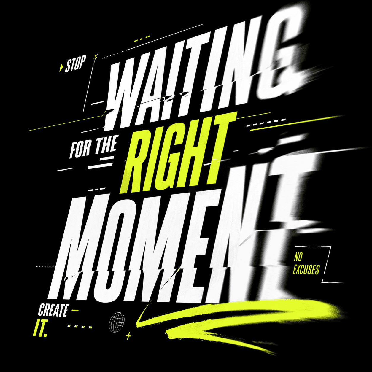
A glitch can feel futuristic.
A stretch can feel experimental.
A blur can feel dreamlike.
The font you choose determines whether the motion feels natural or forced.
When type moves, small weaknesses become more obvious.
A font that looks fine in a static poster may become hard to read when animated. Thin strokes may disappear during fast movement. Decorative details may blur. Tight spacing may create visual noise. Overly complex letterforms may look messy when scaled, rotated, or distorted.
That is why kinetic typography requires a different mindset.
You are not only choosing a font for style. You are choosing a font for behavior.
Ask these questions before using a font in motion:
Does it stay readable when moving quickly?
Does it work at large sizes?
Does it have enough weight to survive blur, texture, or effects?
Does it look good when stretched, masked, or layered?
Does it still feel like the brand when animated?
The best motion fonts usually have strong shapes, clear spacing, and enough personality to carry the scene without becoming unreadable.
Not every font works well in motion. Here are the most useful categories to test.
Bold sans serifs are the safest starting point for kinetic typography. They are readable, strong, and flexible.
Use them for landing page heroes, product announcements, sports graphics, tech campaigns, and social ads.
They work especially well with simple motion: slide-ins, scale-ups, masks, reveals, and scroll-triggered movement.
Condensed fonts are powerful when you need impact in limited space.
They work well for posters, music visuals, fashion campaigns, and editorial layouts. Because the letters are narrow, you can create tall, dramatic compositions that feel energetic.
Be careful with spacing. Condensed fonts can become hard to read if they move too fast or sit too close together.
Variable fonts are a natural fit for motion because they can change along axes like weight, width, slant, or optical size.
Instead of simply moving text from left to right, you can animate the typeface itself. A word can grow heavier as the message becomes more intense. A headline can expand as the user scrolls. A logo can shift between compact and wide versions depending on screen size.
This makes typography feel responsive rather than decorative.
Serifs can bring elegance, drama, and editorial personality to motion.
They work well for luxury brands, cultural projects, film titles, photography portfolios, and fashion campaigns.
The key is to choose serifs with strong contrast and clear shapes. Very delicate serifs may look beautiful in print but become fragile on screen, especially when animated.
Experimental fonts are perfect for art direction, album covers, event posters, and bold campaign visuals.
They can look futuristic, brutalist, handmade, liquid, distorted, or surreal. They are not always the most readable choice, but they can create a memorable visual identity.
Use them for short words, large headlines, or hero moments. Pair them with a cleaner font for everything else.
AI design tools are making it easier to generate visual directions quickly. That means designers can explore more layouts, more styles, and more typographic treatments in less time.
Figma’s 2026 Config announcements focused on new creative materials on the canvas, including code, motion, shaders, generative plugins, and Weave tools.
Shaders are especially interesting for typography because they can add effects like patterns, gradients, textures, distortion, grain, halftones, and blur to design layers. Figma’s shader effects can modify how an existing layer renders, while shader fills can generate textures and procedural backgrounds.
This means typography is becoming more visual and atmospheric. A headline is not just black text on a white background. It can be textured, animated, distorted, layered, and connected to the whole identity system.
But this also creates a risk.
When effects become easy, overusing them becomes easy too.
Good kinetic typography still starts with a good font. Effects should support the message, not hide weak type choices.
Start with the message.
Is the design supposed to feel fast, calm, premium, playful, rebellious, futuristic, or editorial?
Then choose three to five font directions.
For example, if you are designing a launch video for a creative AI tool, you might test:
A bold geometric sans.
A condensed display font.
A variable sans serif.
An experimental tech-style font.
A clean neutral font for supporting text.
Next, preview your actual words.
Do not judge a font by its default specimen. Type your real headline, product name, button label, or campaign phrase. FindFont lets you compare and preview fonts instantly, including side-by-side comparison of multiple fonts.
Then test motion in simple ways.
Scale it from 90% to 100%.
Slide it from 20px below.
Fade it from 0% to 100%.
Animate letter spacing.
Change weight or width if it is a variable font.
Add subtle blur or texture.
Finally, pair it with a readable secondary font.
Kinetic typography is usually the hero. The supporting font should keep everything usable.
The first mistake is choosing a font that only looks good when still.
If the design depends on motion, test the motion early.
The second mistake is animating too many things at once.
Movement should guide attention. If every word moves differently, the viewer does not know where to look.
The third mistake is ignoring readability.
Typography can be expressive, but it still needs to communicate. If the audience cannot read the message, the animation has failed.
The fourth mistake is using trendy effects without a brand reason.
Glitch, blur, 3D rotation, liquid distortion, and grain can all look good. But they should match the tone of the project.
A wellness brand probably does not need aggressive glitch typography. A gaming launch probably does not need a delicate editorial serif fade unless the concept supports it.
Kinetic typography is one of the clearest signs that design is becoming more dynamic in 2026.
Fonts are no longer chosen only for static layouts. They are chosen for motion, interaction, AI-generated visuals, social video, responsive interfaces, and expressive brand systems.
The best designers will not simply ask, “Does this font look good?”
They will ask:
Does it move well?
Does it scale well?
Does it pair well?
Does it still communicate clearly?
Does it make the brand feel more alive?