10 Font Trends Designers Should Watch in 2026
Discover the biggest font and typography trends of 2026, from expressive serifs and anti-design type to variable fonts, retro futurism, AI-inspired branding, and human-made typography.

Discover the biggest font and typography trends of 2026, from expressive serifs and anti-design type to variable fonts, retro futurism, AI-inspired branding, and human-made typography.
Typography is changing fast.
For years, digital design was dominated by clean sans-serif fonts, minimal layouts, and safe brand systems. That look still works, but in 2026, designers are moving toward typography with more personality, emotion, and movement.
Fonts are no longer just a background design choice. They are becoming one of the main ways brands show who they are.
From expressive serif fonts to imperfect anti-design lettering, from flexible variable fonts to retro-futurist type, the biggest font trends of 2026 all point in one direction: typography needs to feel more human, more memorable, and more adaptable.
Here are the font trends designers, founders, marketers, and brand builders should watch in 2026.
Serif fonts are making a strong return, especially in branding, editorial design, and AI-related companies.
For the last decade, many tech companies used simple geometric sans-serif fonts to look modern and scalable. But that created a problem: everything started to look the same.
In 2026, more brands are using serif fonts to feel warmer, smarter, more trustworthy, and more distinctive. This is especially interesting in AI branding, where companies want to balance advanced technology with a more human personality.
A serif font can instantly make a brand feel more editorial, thoughtful, premium, or established. It gives digital products a sense of depth that plain sans-serif fonts sometimes lack.
Best for: AI brands, personal brands, luxury brands, newsletters, editorial websites, premium SaaS, boutique studios.
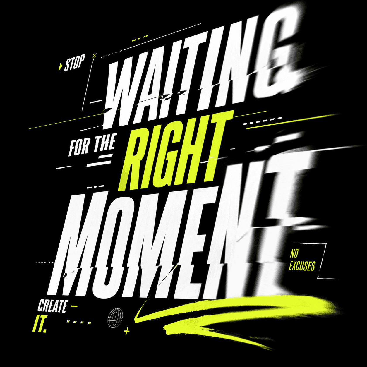
Anti-design is one of the most interesting visual movements right now.
Instead of perfect grids, polished spacing, and ultra-clean layouts, anti-design embraces roughness, imperfection, awkward spacing, unexpected type choices, and intentionally raw visuals.
This does not mean bad design. Good anti-design is still intentional. The goal is to create something that feels more alive, less corporate, and less automated.
As AI tools make it easier for everyone to create clean visuals, imperfect typography can become a way to stand out. In a world full of polished templates, raw design can feel more authentic.
Best for: music brands, fashion campaigns, creator brands, cultural projects, experimental websites, posters, Gen Z-focused brands.
Variable fonts are becoming more important because brands now need typography that works across many different formats.
A font has to look good on a mobile screen, a desktop website, a social post, a pitch deck, a product UI, and sometimes even in motion graphics.
Variable fonts allow one font file to contain different weights, widths, and styles. That gives designers more flexibility without needing a large number of separate font files.
For websites and digital products, variable fonts are especially useful because they can help create responsive typography systems that feel consistent across devices.
Best for: websites, SaaS products, mobile apps, dashboards, design systems, responsive branding.
The more digital design becomes automated, the more people value human details.
Hand-drawn fonts, imperfect letterforms, irregular spacing, and naive typography are becoming more attractive because they feel personal and less machine-made.
This trend is closely connected to the wider cultural shift away from overly polished branding. Many audiences are tired of brands that look perfect but feel empty.
Human-made typography can make a brand feel warmer, more honest, and more memorable.
Best for: independent brands, cafes, lifestyle products, handmade goods, local businesses, creative studios, personal brands.
In 2026, typography needs to stop the scroll.
That is why bold display fonts are becoming more important in social media design, advertising, posters, and landing pages.
Display fonts are not designed for long paragraphs. They are made to create impact. A strong display font can become the main visual identity of a brand or campaign.
The key is to use them carefully. A bold display font works best when it has space to breathe. If everything is loud, nothing stands out.
Best for: posters, launch campaigns, social graphics, music covers, event branding, hero sections, logos.
Retro-futurism combines old visions of the future with modern design.
Think space-age curves, chrome-like letters, sci-fi shapes, 1970s technology aesthetics, early computer graphics, and Y2K-inspired forms.
This trend works because it feels nostalgic and futuristic at the same time. It is familiar, but still exciting.
Retro-futurist fonts are especially useful for brands that want to look bold, creative, technical, or culturally aware.
Best for: tech products, music visuals, fashion brands, gaming brands, AI tools, creative agencies, experimental startups.
More digital brands are borrowing from magazine and editorial design.
Instead of using only simple UI fonts, brands are combining strong headlines, elegant serifs, large type scales, and more intentional text hierarchy.
This gives websites and landing pages a more premium, story-driven feeling.
Editorial typography works especially well when a brand wants to communicate taste, intelligence, and authority. It can make even a simple website feel more curated and high-end.
Best for: newsletters, agencies, consultants, luxury products, founder-led brands, media brands, high-ticket services.
Minimalism is not disappearing. It is evolving.
The old version of minimal typography often looked extremely neutral. In 2026, designers still want clean fonts, but they also want small details that make the brand recognisable.
That could mean a slightly unusual “a”, a softer curve, a sharper terminal, a wider letter shape, or a more distinctive number style.
The goal is quiet personality. The font should still feel clean, but not generic.
Best for: premium websites, portfolios, architecture brands, SaaS products, finance brands, wellness brands, design studios.
Typography is increasingly designed for movement.
Brands now need fonts that work in static layouts and animated content. A headline may appear on a website, then animate in a product video, then appear again in a social ad.
This is why kinetic typography and motion-friendly font systems are becoming more relevant.
Fonts with clear shapes, flexible weights, and strong rhythm usually work better in motion. Designers are thinking not only about how a font looks, but how it behaves when it moves.
Best for: product videos, launch films, social ads, app onboarding, motion graphics, creator content.
AI is influencing typography in two ways.
First, AI companies are using typography to look more human, trustworthy, and less cold. This is one reason serif fonts and editorial styles are appearing in AI branding.
Second, designers are experimenting with AI-generated and algorithmic type. New research and creative tools are making it easier to explore font generation, typographic conditioning, and variable font creation.
However, the best AI-inspired typography is not random. It still needs taste, hierarchy, readability, and a clear brand purpose.
Best for: AI tools, generative products, experimental brands, future-facing startups, creative technology projects.
Not every font trend is right for every brand.
A law firm probably should not use chaotic anti-design typography. A music festival probably should not rely only on a quiet corporate sans-serif. A luxury skincare brand may need a very different type system from a developer tool.
Before choosing a font, ask:
What should the brand feel like?
Who is the audience?
Where will the font be used?
Does it need to work on mobile?
Is readability more important than personality?
Should the brand feel premium, playful, technical, human, bold, or classic?
The best typography is not just trendy. It matches the message.
Trends are useful for inspiration, but they can become a problem when copied without strategy.
Be careful with:
Overly distorted fonts that are hard to read
Too many fonts in one design
Display fonts used for long text
Trendy typefaces that do not match the brand
AI-generated lettering with poor consistency
Retro fonts that make the brand look outdated instead of nostalgic
Minimal fonts that feel too generic
Good typography should feel intentional. A font should support the brand, not distract from it.
The biggest font trends of 2026 show a clear shift: typography is becoming more expressive, more flexible, and more human.
Clean fonts still matter, but brands now need more than safe minimalism. They need typefaces that create recognition, emotion, and personality.
Whether you are designing a logo, building a website, creating a pitch deck, or refreshing a brand identity, the right font can completely change how your work feels.
In 2026, the best typography will not just look good. It will feel distinctive, adaptable, and alive.