Free alternatives to San Francisco font (or SF Pro)
SF Pro is free to download but licensed only for Apple-platform app mock-ups. We measured 15 free fonts against it and picked the five closest, plus free matches for SF Mono, SF Pro Rounded and New York.
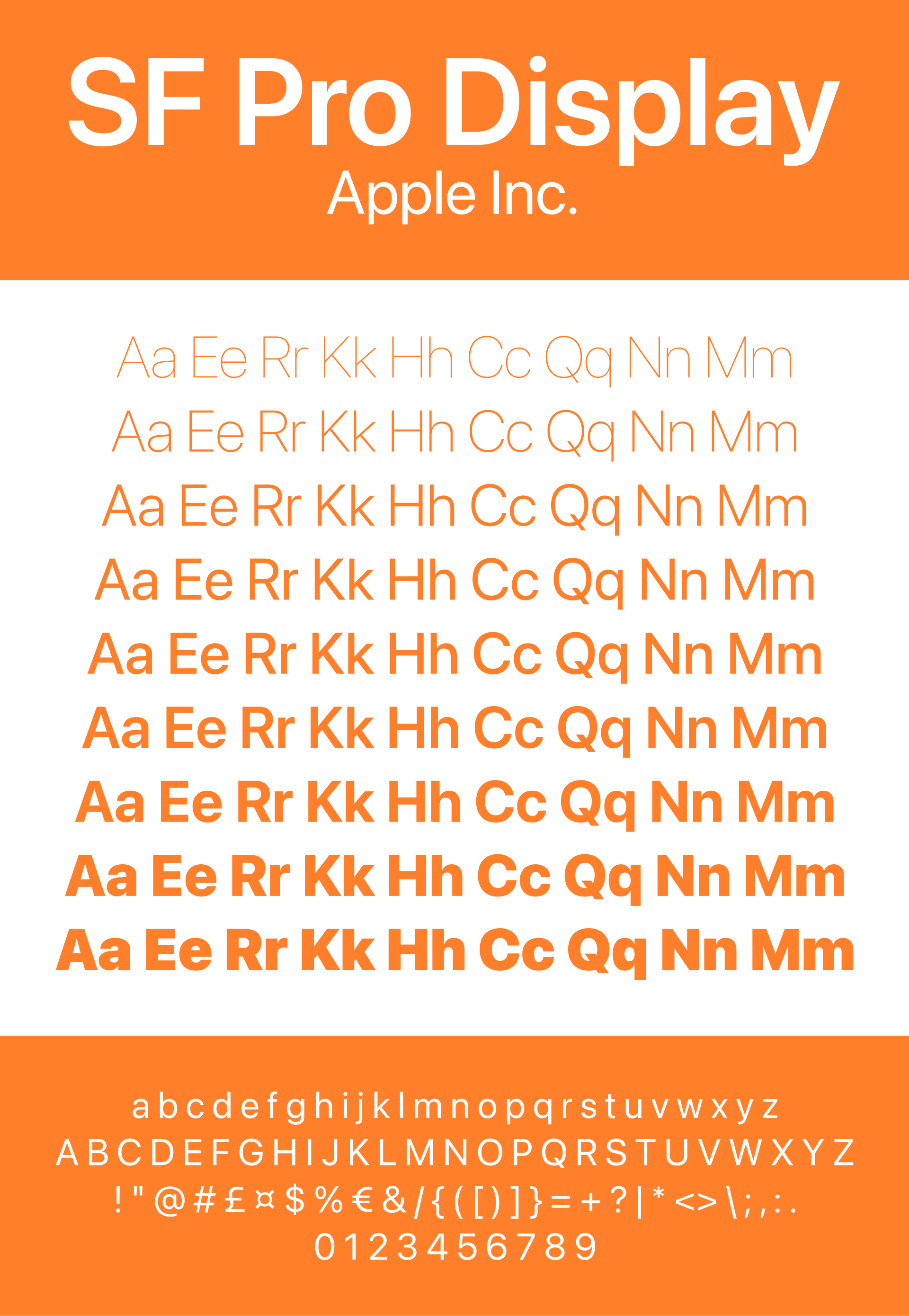
SF Pro is the system font of the iPhone, iPad and Mac. Apple describes it as a neutral, flexible sans serif with nine weights, four widths, optical sizes and a rounded variant (Apple).
You can download it free from Apple, but you can't use it freely. Apple's licence allows it "solely for creating mock-ups of user interfaces" for software that runs on Apple's own operating systems (Apple font licence). A website you host, an Android app, a logo, a printed flyer or a Canva design all fall outside that.
So we measured 15 free fonts against SF Pro, at the same size and weight. These five came closest, and all of them are free for commercial use under the SIL Open Font License.
The five closest free fonts to SF Pro
| If you need | Use | How close it measured |
|---|---|---|
| The best all-round substitute | Inter | x-height 2.8% taller, line length 0.5% shorter |
| The closest proportions | Onest | x-height within 0.1%, line length 1.1% shorter |
| A product or developer look | Geist | x-height 0.7% taller, line length 1.5% shorter |
| Many languages | Noto Sans | x-height 1.8% taller, line length 0.7% shorter |
| Public services and forms | Public Sans | x-height 1.8% shorter, line length 2.3% shorter |
Each card below shows the same interface text, so you can compare them directly. To try your own words in all five at once, open them in the findfont compare tool.
1. Inter
Best all-round substitute for SF Pro
Rasmus Andersson designed Inter for computer screens. In our measurements its lowercase letters stood 2.8% taller than SF Pro's and the same sentence ran 0.5% shorter, so text sets almost exactly as long.
Like SF Pro, Inter has an optical size axis. Its letters adjust between small text and large display sizes in one font file. It covers weights 100 to 900 and Latin, Greek and Cyrillic.
Use Inter for app interfaces, dashboards, websites and product marketing.
Preview and download Inter. Licensed under the SIL Open Font License 1.1.
2. Onest
Closest proportions to SF Pro in our measurements
Onest, by Dmitri Voloshin and Andrey Kudryavtsev, matched SF Pro's x-height to within 0.1%, and the same sentence ran just 1.1% shorter. No other font we tested matched both numbers as closely.
It has weights from 100 to 900 and covers Latin and Cyrillic, but not Greek.
Use Onest for websites and apps where you want text to fill the same space SF Pro would.
Preview and download Onest. Licensed under the SIL Open Font License 1.1.
3. Geist
Best for product and developer sites
Geist is Vercel's open-source typeface. Its x-height measured 0.7% taller than SF Pro's and the test sentence ran 1.5% shorter. It has weights from 100 to 900 and covers Latin, Greek and Cyrillic.
Geist has a matching monospaced family, Geist Mono, which makes the pair a free stand-in for SF Pro with SF Mono.
Use Geist for product sites, documentation and developer tools.
Preview and download Geist. Licensed under the SIL Open Font License 1.1.
4. Noto Sans
Best for multilingual products
Noto Sans is part of Google's Noto project. findfont's file has more than 4,500 glyphs for Latin, Greek and Cyrillic. Other Noto families cover more scripts in a matching style.
It measured close to SF Pro: x-height 1.8% taller, line length 0.7% shorter. Like SF Pro, it can get narrower. Its width axis runs from 62 to 100, and its weights from 100 to 900.
Use Noto Sans for products in several languages and interfaces that show user-generated text.
Preview and download Noto Sans. Licensed under the SIL Open Font License 1.1.
5. Public Sans
Best for public services and forms
The United States Web Design System built Public Sans, starting from Libre Franklin, as a neutral typeface for interfaces, text and headings. Its x-height measured 1.8% shorter than SF Pro's and the test sentence ran 2.3% shorter.
findfont's file covers Latin only, in weights from 100 to 900.
Use Public Sans for government and civic sites, forms and long service pages.
Preview and download Public Sans. Licensed under the SIL Open Font License 1.1.
How we measured
We compared each font with SF Pro as installed with macOS, using the same settings for all of them: weight 400, normal width, and, for fonts with an optical size axis, size 17, the text size SF Pro uses for body copy. We measured the height of the lowercase x and the width of the sentence "The quick brown fox jumps over the lazy dog". The last column compares width again after scaling each font to SF Pro's x-height, which shows how much text grows or shrinks if you resize the replacement to look the same size.
| Font | x-height vs SF Pro | Same sentence, same size | Same sentence, x-height matched |
|---|---|---|---|
| Onest | +0.1% | -1.1% | -1.2% |
| Golos Text | +0.7% | +1.0% | +0.4% |
| Geist | +0.7% | -1.5% | -2.2% |
| Noto Sans | +1.8% | -0.7% | -2.4% |
| Inter | +2.8% | -0.5% | -3.1% |
| Public Sans | -1.8% | -2.3% | -0.5% |
| Manrope | +2.6% | -4.1% | -6.5% |
| Roboto | +0.4% | -6.5% | -6.9% |
| DM Sans | -4.8% | -2.3% | +2.6% |
| IBM Plex Sans | -2.0% | -6.1% | -4.2% |
| Work Sans | -5.0% | +4.8% | +10.4% |
| Figtree | -5.0% | -5.5% | -0.5% |
| Hanken Grotesk | -6.3% | -5.1% | +1.3% |
| Inter Tight | +3.7% | -9.1% | -12.3% |
| Source Sans 3 | -7.7% | -12.4% | -5.1% |
Measured on 19 October 2026. Golos Text measured very close too, but its lightest weight is 400, so it can't stand in for SF Pro's light and thin styles. Roboto has a similar x-height but sets about 6.5% narrower.
Numbers don't capture everything. Letter shapes, spacing and the feel of a paragraph matter as much, so compare your own text before you decide.
Is SF Pro free to use?
It is free to download, from Apple's fonts page, as a Mac installer. The licence that comes with it is narrow. Apple allows SF Pro only for creating mock-ups of user interfaces for software running on its operating systems.
In practice:
- Designing an iPhone or Mac app? You can use SF Pro in your mock-ups.
- Building a website? You can't upload SF Pro to your server or convert it to a web font. See the next section for the legal way to show it on Apple devices.
- Making an Android app, a logo, print work or social graphics? Use a free alternative.
How to show SF Pro on your website without hosting it
Apple devices already have San Francisco built in. You don't need to host it to use it: name the system font in your CSS, and Apple devices draw your text with their own copy, while other devices fall back to a font you can host.
font-family: -apple-system, BlinkMacSystemFont, "Inter", sans-serif;
In this stack, -apple-system is read by Safari, by every browser on iPhone and iPad, and by Firefox on a Mac. BlinkMacSystemFont is read by Chrome and Edge on a Mac. Both use the San Francisco font already on the device. Windows and Android visitors get Inter, which you host yourself under its open licence.
The shorter keyword system-ui asks for the system font on every platform, so visitors see San Francisco on Apple devices, Segoe UI on Windows and Roboto on Android. Bootstrap's "native font stack" works this way (Bootstrap). Choose it when you want each visitor's own system look. Choose the stack above when you want one consistent look outside Apple devices.
Free alternatives to the rest of Apple's font family
SF Pro has siblings. We measured each against a few free candidates in the same way.
SF Pro Rounded
Nunito is the most practical free rounded sans, with weights from 200 to 1000. No free rounded font we tested matches SF Pro Rounded's width, though. Nunito set 8.5% wider and Varela Round 14.7% wider. Plan for slightly longer lines.
SF Mono
Roboto Mono and Geist Mono matched SF Mono's x-height to within 0.2%. Every monospaced font we tested set 2.9% narrower per character. IBM Plex Mono is a good third choice.
New York
New York is Apple's serif companion to San Francisco. Source Serif 4, by Frank Grießhammer at Adobe, came within 1% of it on both x-height and line length. Like New York, it has optical sizes.
Using an SF Pro look-alike in Canva
SF Pro's licence doesn't cover Canva designs. Canva Pro, Teams, Business, Education and Nonprofits accounts can upload their own fonts to a Brand Kit, in OTF, TTF or WOFF format, and Canva asks you to upload only fonts you're licensed to use (Canva Help Center).
There's one catch: Canva doesn't support variable fonts, and the downloads for Inter, Onest and Geist are variable font files. Check Canva's own font list for your pick first. If it isn't there, upload static TTF files of that family, one file per weight. The family's download on Google Fonts includes them in a folder called static.
Frequently asked questions
What type of font is SF Pro?
A sans serif. Apple calls it a neutral, flexible sans-serif typeface and uses it as the system font across its platforms. It has nine weights, four widths, optical sizes and a rounded variant, and supports more than 150 languages (Apple).
Which free font is closest to SF Pro?
In our measurements, Onest matched SF Pro's proportions most closely. Inter is the best all-round substitute: it measured within 3%, it has optical sizes like SF Pro, and it is built for screens.
What Google Fonts are similar to San Francisco?
Inter, Onest, Geist, Noto Sans and Public Sans are all on Google Fonts and all measured within 3% of SF Pro.
Where can I download SF Pro?
From Apple's fonts page. Read the licence first: it covers only mock-ups of interfaces for software on Apple's platforms.
Can I use SF Pro on my website?
You can't host the font files. You can name the system font in your CSS, so Apple devices show their built-in San Francisco and everyone else sees a free fallback such as Inter.
Is SF Pro free for commercial use?
Only within Apple's licence, which covers mock-ups of interfaces for Apple-platform software. For commercial websites, apps on other platforms, branding and print, use an open-licence alternative.
What font in Canva looks like SF Pro?
Search Canva's font list for Inter or Roboto first. On Canva Pro or a team plan you can also upload a font, but it must be a static TTF or OTF file, because Canva doesn't support variable fonts.
More free font alternatives
- Free alternatives to Arial
- Free alternatives to Segoe UI
- Free alternatives to Aptos
- Free alternatives to Gotham
- Free fonts similar to Helvetica
- Free alternatives to Avenir
- Free alternatives to Futura
- Free alternatives to Proxima Nova
- Free alternatives to Times New Roman
Sources
- Apple Developer, Fonts, including the San Francisco font licence. SF Pro features, family members and licence terms.
- Bootstrap, Reboot: native font stack.
- Canva Help Center, Upload and use Brand Kit fonts. Plans, formats, licensing note, no variable fonts.
- SIL, Open Font License.
- Measurements: findfont, 19 October 2026, using fontTools on SF Pro, SF Pro Rounded, SF Mono and New York as installed with macOS, and on the font files in findfont's catalogue.