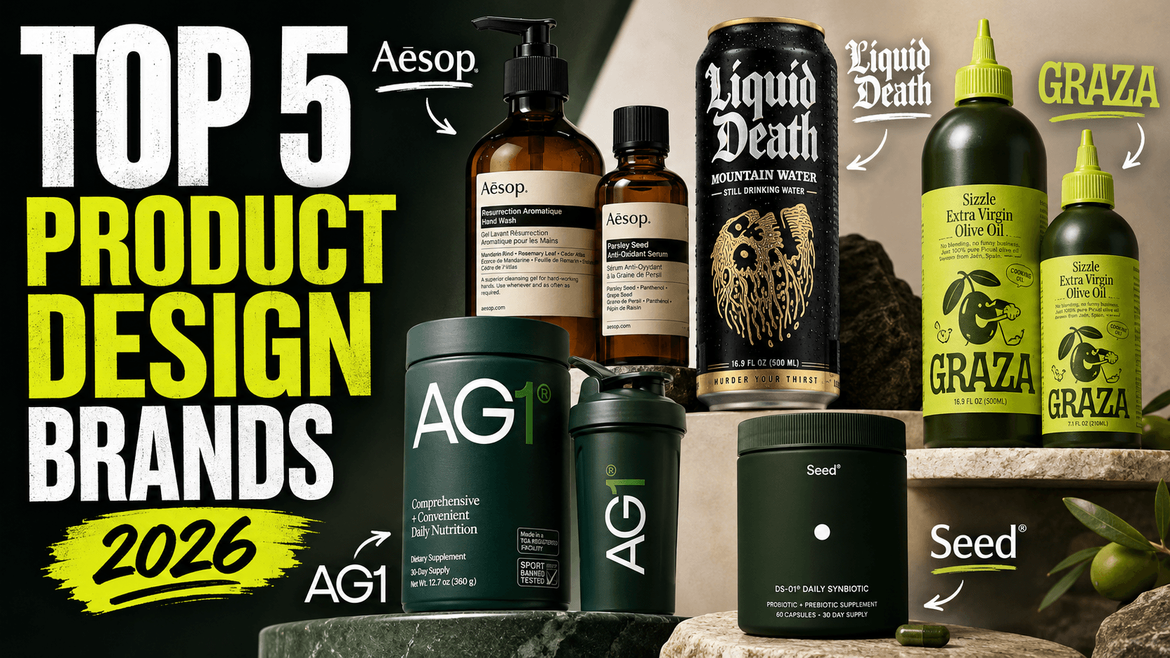
5 Brands With the Best Product Design in 2026
Discover five brands redefining product design in 2026, from Aesop and Liquid Death to Graza, AG1 and Seed—and the lessons behind their success.
5 Brands With the Best Product Design in 2026
The brands with the best product design in 2026 are not necessarily the ones with the most elaborate packaging.
They are the brands that make every part of the customer experience feel intentional.
The product is recognizable from across a room. The packaging helps people understand how to use it. The website, unboxing experience, retail environment and brand voice feel like parts of the same system.
For this list, we evaluated brands according to five factors:
Product and packaging functionality
Visual distinctiveness
Consistency across physical and digital touchpoints
Customer rituals and repeat-use experience
Strength of the overall brand world
This is an editorial ranking of design and brand experience—not an assessment of nutritional value, health benefits or product effectiveness.
1. Aesop: The Best Overall Brand Experience
Aesop remains one of the clearest examples of how product design can grow into an entire cultural world.
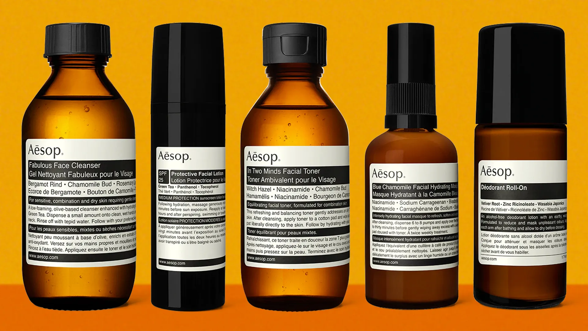
At product level, its visual language is remarkably restrained: amber containers, minimal labels, literary product descriptions and an apothecary-inspired presentation. Individually, none of these elements is excessively expressive. Together, they form one of the most recognizable design systems in beauty and personal care.
The more important lesson, however, is that Aesop does not treat packaging as the limit of product design.
Its signature stores are designed in response to their individual neighbourhoods, materials and architectural histories rather than being reproduced as identical retail templates. Aesop describes its stores as spaces intended to fit comfortably within their surroundings and respect local history and values.
That philosophy continues to evolve. During Milan Design Week in 2026, Aesop created an experiential installation involving contemplative lighting, repurposed construction materials and more than 10,000 salvaged fragrance bottles. The installation also introduced the brand’s first lighting product, demonstrating how comfortably Aesop can extend beyond skincare without abandoning its identity.
Why Aesop’s design works
Aesop sells a feeling before it sells an individual formulation: calm, intelligence, ritual and considered living.
The packaging, store architecture, writing style and service experience all communicate the same idea. Customers are not simply buying hand wash or facial cleanser. They are temporarily entering an Aesop environment.
The product design lesson
Build a recognisable system, not a decorative package.
A strong brand should remain identifiable when the logo is removed. Its materials, proportions, tone of voice, photography and physical environment should still feel connected.
2. Liquid Death: The Best Brand Voice and Category Disruption
Liquid Death demonstrates that product design can change how people feel about an otherwise ordinary category.
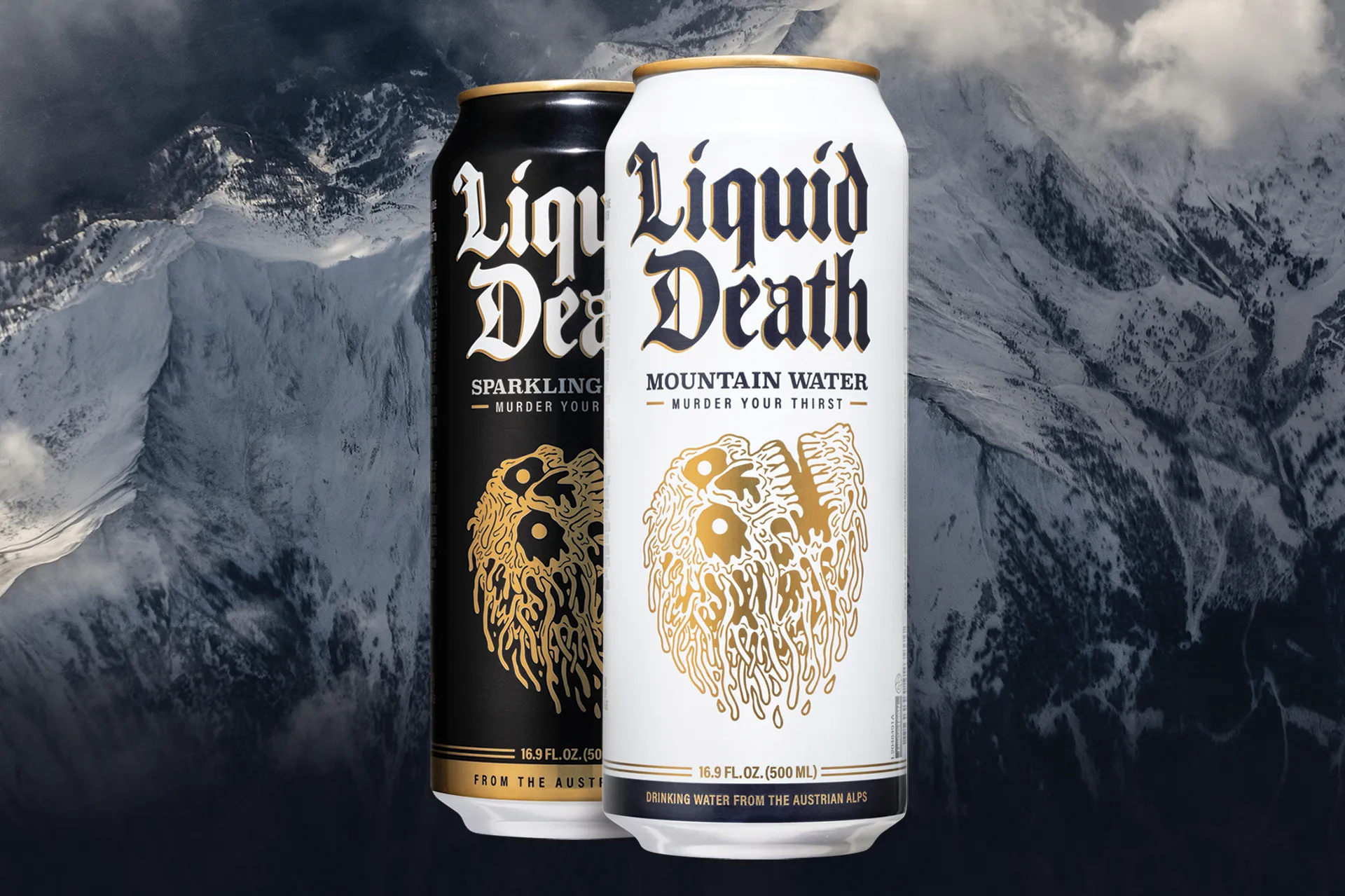
The company packages water and other drinks in tall aluminium cans using gothic typography, illustrated skulls and language borrowed from heavy-metal culture. Rather than using the calm blue landscapes and purity messaging commonly associated with bottled water, Liquid Death presents hydration with the visual energy of beer, energy drinks and underground music.
The contrast is the product.
Liquid Death explains its positioning directly: historically, some of the most entertaining branding was reserved for beer, junk food and other less healthy categories. Its objective was to bring that same level of entertainment to better-for-you beverages. The company currently uses this identity across water, iced tea and sparkling energy products.
The cans are not merely containers. They allow someone who is not drinking alcohol to hold something that feels socially compatible with a concert, bar, festival or party. That means the packaging solves an emotional and behavioural problem as well as a functional one.
Why Liquid Death’s design works
Many brands begin with a list of product benefits and then look for an attractive design.
Liquid Death began with a social identity.
Its name, packaging, copywriting, merchandise and campaigns all reinforce the same exaggerated personality. Even its environmental messaging—presented under phrases such as “Death to Plastic”—fits naturally inside the brand rather than appearing as a separate corporate initiative.
The product design lesson
Design for the situation in which the customer uses the product.
Ask what the customer wants to feel, signal or avoid in that moment. Sometimes the greatest product-design opportunity is not changing the underlying product. It is changing the role the product plays in someone’s life.
3. Graza: The Best Function-Led Food Packaging
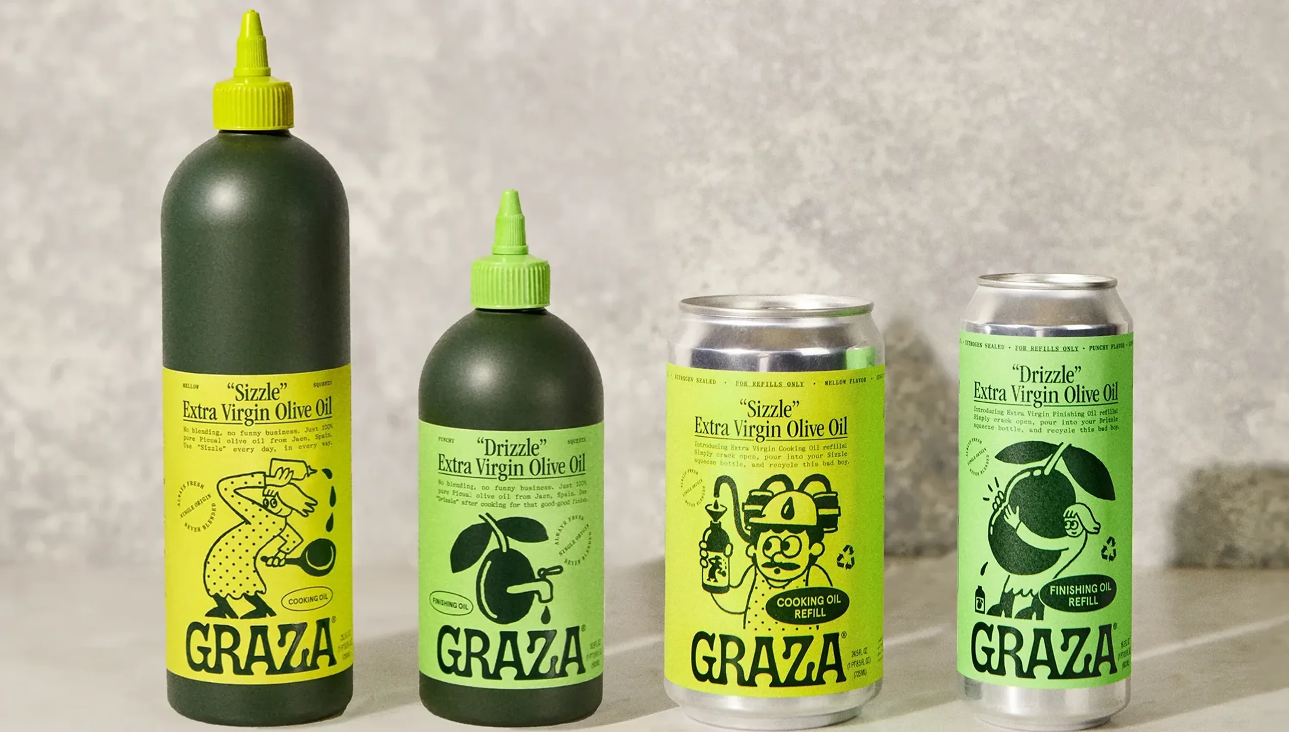
Graza turned olive-oil packaging into part of the cooking experience.
Its most recognisable design decision is the squeeze bottle—a format associated more closely with professional kitchens and condiments than premium olive oil. Graza says its original packaging was inspired by chefs who already used squeeze bottles to control and distribute oil while cooking.
That decision makes the product easier to hold, aim and use with one hand. It also gives Graza an unmistakable silhouette in kitchens, social-media posts and supermarket displays.
But the bottle is only one part of the system.
Graza divides its core oils according to clear use cases. “Drizzle” is positioned as a finishing oil, while “Sizzle” is intended for everyday cooking. The company has since added “Frizzle” for higher-temperature cooking. Instead of asking customers to interpret technical olive-oil terminology, the names communicate when and how each product should be used.
Graza also offers recyclable refill cans, allowing customers to keep using the squeeze format rather than continually replacing the primary bottle.
Why Graza’s design works
Graza’s visual identity is playful, but its success is rooted in practical decisions:
The bottle improves control.
The names reduce confusion.
The colour coding differentiates products.
The refill system encourages repeat purchasing.
The packaging naturally appears in cooking content.
Its branding attracts attention, while its functionality justifies why the design exists.
The product design lesson
Use packaging to teach customers how to use the product.
The best food packaging does more than protect ingredients. It reduces decision-making, prevents incorrect use and makes the desired behaviour feel obvious.
For founders building a food or wellness brand, Graza may be the most directly useful example on this list.
4. AG1: The Best Subscription Onboarding Experience
AG1 has transformed a powdered supplement into a structured daily ritual.
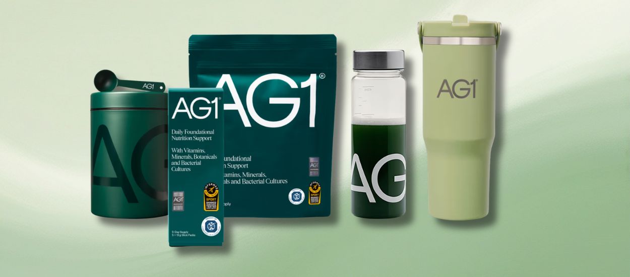
The product experience extends far beyond the pouch. A first-time subscription is presented as a complete welcome system containing a storage canister, scoop, shaker, travel packs and accompanying vitamin D3 and K2 product. AG1 also offers individually portioned travel packs for maintaining the routine away from home.
Each component addresses a possible point of friction:
The scoop standardises preparation.
The canister gives the product a permanent place in the kitchen.
The shaker supports immediate use.
The travel packs protect the routine during trips.
The subscription removes the need to reorder manually.
This is an important distinction. AG1 is not only designing a supplement container; it is designing the customer’s first month with the product.
Its tightly controlled green palette, lifestyle photography and science-oriented presentation make the experience consistent across advertising, the website, packaging and subscription delivery.
Why AG1’s design works
Recurring products often fail because customers forget to use them, do not know where to store them or lose motivation after the first few days.
AG1’s physical ecosystem attempts to turn a purchase into a repeated morning action. Even the free welcome items serve a strategic purpose: they increase the visibility and permanence of the routine.
The product design lesson
For subscription products, design the habit as carefully as the object.
Map the complete customer journey:
Where will the product be stored?
What must happen before it can be used?
What might interrupt the routine?
What will remind the customer to continue?
What should the second delivery feel like?
The best subscription design reduces friction before cancellation becomes a possibility.
5. Seed: The Best Science-Led Wellness Packaging
Seed shows how a health brand can communicate scientific credibility without making the customer experience feel sterile or intimidating.
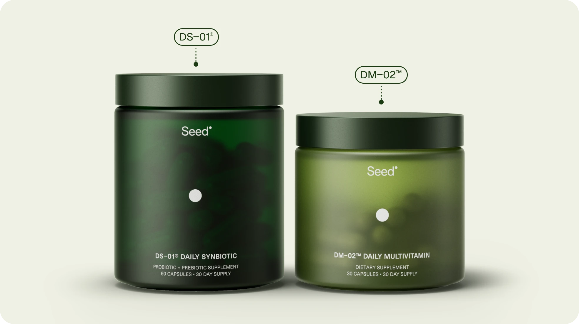
Its DS-01 Daily Synbiotic welcome kit includes a refillable glass jar, a smaller glass travel vial and a 30-day capsule supply. Future deliveries arrive as refills rather than repeating the complete package.
The physical components have been designed around real behaviours. The main jar becomes a permanent storage object, while the travel vial holds approximately one week of capsules. Seed’s packaging system also uses elements such as post-consumer recycled plastic lids and a bio-based tray made from starch, natural fibres and water.
Visually, Seed occupies a distinctive space between laboratory equipment, premium skincare and consumer technology. Its deep green containers and precise typography communicate research and control, while the rounded shapes keep the product from feeling overly clinical.
Why Seed’s design works
Scientific wellness brands face a difficult balance.
Too much lifestyle branding can make the product appear untrustworthy. Too much technical information can make it inaccessible. Seed uses design to create hierarchy: the product looks serious, but the routine remains simple.
Its sustainability system also feels integrated into the customer journey rather than added as a badge on the outer box.
The product design lesson
Turn technical complexity into a simple physical ritual.
Customers do not need every scientific detail presented at once. Product design should help them understand what to do first, where to store the product and how to continue using it consistently.
What These Product Design Brands Have in Common
Although these five brands look completely different, they follow several of the same principles.
They are recognisable by shape
Graza has its green squeeze bottle. Liquid Death has the tall can. Aesop has its amber containers. Seed has the green refillable jar.
A distinctive silhouette can become more valuable than an elaborate logo because it remains recognisable in photographs, kitchens, bathrooms and retail displays.
They create rituals
Aesop turns hand washing into a sensory experience. AG1 turns preparation into a morning routine. Seed creates a monthly refill cycle. Graza makes squeezing oil directly over food feel natural.
The product becomes stronger when the act of using it is memorable.
They reduce uncertainty
Graza explains which oil is intended for cooking and which is intended for finishing. AG1 supplies the measuring and mixing equipment. Seed provides separate home and travel containers.
Good design answers questions before the customer needs to ask them.
They remain consistent without becoming repetitive
Aesop’s stores differ architecturally, yet still feel unmistakably Aesop. Liquid Death can introduce new products and campaigns without losing its voice. Graza can extend its product range while maintaining its packaging logic.
Consistency should preserve a brand’s principles, not force every object or space to look identical.
Final Verdict: Which Brand Has the Best Product Design in 2026?
Aesop takes the top position for overall brand experience.
Its strongest achievement is not one bottle, label or store. It is the consistency with which the company connects product packaging, writing, architecture, service and culture.
However, the most relevant example depends on what you are designing:
Study Aesop for premium brand worlds and retail experience.
Study Liquid Death for positioning and verbal identity.
Study Graza for functional food packaging.
Study AG1 for subscriptions and habit formation.
Study Seed for science-led wellness and refill systems.
The central lesson is simple: exceptional product design does not stop when the package is finished.
It continues through the way the product is discovered, opened, stored, used, remembered and purchased again.
Frequently Asked Questions
What brand has the best product design in 2026?
Aesop is our choice for the best overall product and brand experience in 2026. Its packaging, store architecture, service and communication form a consistent but adaptable design system.
What makes product design successful?
Successful product design combines function, usability, visual identity and emotional relevance. It should help customers understand the product while making the experience more distinctive and enjoyable.
Why is Graza’s packaging so effective?
Graza’s squeeze bottle improves control while cooking and makes the product visually recognisable. Names such as “Drizzle” and “Sizzle” also explain the intended use of each olive oil, reducing customer confusion.
Is packaging design the same as brand experience?
No. Packaging is one part of the brand experience. The complete experience also includes the website, product instructions, unboxing, customer service, retail environment, subscription process and repeated use.
Why is Liquid Death considered a product-design brand?
Liquid Death uses packaging to change the social meaning of drinking water. Its can format and heavy-metal identity allow the product to occupy situations and cultural spaces traditionally associated with beer or energy drinks.