
A dated editorial typeface credit
Creative director Wyatt Mitchell discusses the 2013 recut of Irvin, including ligatures, in the magazine’s own design video. It connects the refreshed type to Rea Irvin’s original work. This attribution is scoped to that editorial refresh; it does not establish every current masthead file or an authorized retail release.
Evidence for this attribution ↓A paid alternative to explore
Compare this available font with the original reference above. It is an editorial alternative, not an attribution of the original lettering.
Paid alternative
New Yorker Type
Affiliate link: we may earn a commission if you buy through this link. Check pricing and choose your license at MyFonts.
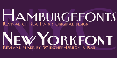
Gert Wiescher describes New Yorker Type as a hand-drawn revival of the typeface used by The New Yorker magazine. Published by Wiescher Design and sold on MyFonts, it is a commercial reinterpretation to compare with the original reference, not the magazine’s documented 2013 Irvin recut. Choose the license that fits your project.
Free alternatives
Compare the actual letterforms with the same text. These are editorial alternatives, not fonts attributed to The New Yorker.
Free alternative
Libre Baskerville
Loading font preview…
Regular · Latin specimen
Compare a quieter editorial serif with your own headline and supporting text. It is not Irvin.
View fontFree alternative
Cinzel
Loading font preview…
Regular · Latin specimen
Try a different formal uppercase title. This is an independent direction, not magazine attribution.
View fontChoose typography for more than a masthead
For an original magazine or newsletter, compare a short publication name with a long article headline. A distinctive display face may work well in one and become distracting in the other. Test punctuation, proper names and mixed case. Consider how ligatures behave in ordinary words, and check that a narrow column does not produce awkward line breaks. Keep body text comfortable at its actual size. A publication’s identity comes from a repeatable hierarchy across headlines, captions and sections, not only the appearance of its name.
New Yorker Type: a commercial revival
On the MyFonts family page, Gert Wiescher describes New Yorker Type as a revival he began in 1985, redrawing the magazine’s letterforms by hand. Wiescher Design offers Regular and Bold styles. This makes it a relevant paid alternative to compare with the magazine’s lettering; it does not establish that the magazine uses these retail font files or that they are the documented 2013 Irvin recut. Review the available styles and choose the license needed for print, web or other use before purchase. Libre Baskerville and Cinzel remain free comparisons with different letter shapes. FindFont does not distribute New Yorker Type or unverified Irvin font files.
Evidence for this attribution ↓Common questions
Does this page provide the magazine’s original font?
No. The inspected source identifies a dated recut, but an authorized original-file distribution is not established.
Is New Yorker Type the magazine’s original Irvin font?
New Yorker Type is Gert Wiescher’s independent hand-drawn revival of the magazine’s lettering, sold by Wiescher Design on MyFonts. It is not established as the same font file as the magazine’s documented 2013 Irvin recut.
Sources & evidence
Editorial review completed October 2, 2026.
- The New Yorker — 2013 design refresh
Official video with creative director Wyatt Mitchell
- MyFonts — New Yorker Type and designer’s account
Authorized family and license listing with Gert Wiescher’s description of his revival
- The New Yorker — logo artwork and reuse record
Image provenance and copyright-status record; separate from font attribution
