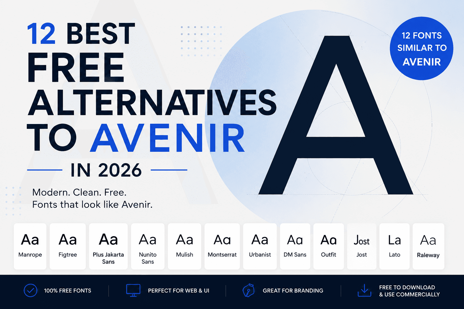
12 Best Free Alternatives to Avenir in 2026
Discover the best free Avenir alternatives for logos, websites, apps and branding, including Manrope, Figtree, Montserrat and Plus Jakarta Sans
12 Best Free Alternatives to Avenir in 2026
Avenir is one of those typefaces that seems to work almost everywhere. It feels geometric without appearing mechanical, modern without becoming trendy and professional without looking cold.
Originally designed by Adrian Frutiger in 1988, Avenir was influenced by geometric typefaces such as Futura and Erbar. However, Frutiger introduced subtle optical corrections and more human proportions, making Avenir considerably more comfortable to read than many strictly geometric sans-serifs. Avenir Next later expanded and modernised the family for wider use across print, branding and digital interfaces.
The problem is that Avenir is not generally available as a completely free font. Depending on where and how you use it, you may need an appropriate desktop, web, app or commercial licence.
Fortunately, several excellent open-source typefaces recreate different parts of Avenir’s personality. Some capture its clean geometry, while others come closer to its friendly proportions or excellent readability.
1. Manrope
Best overall free alternative to Avenir
Manrope is our strongest overall recommendation for designers looking for a free replacement for Avenir.
It combines geometric construction with subtle humanist details, giving it the same balance between precision and approachability that makes Avenir so versatile. Its circular forms, clean lowercase letters and controlled spacing work especially well in contemporary brand identities.
Manrope feels slightly more technical than Avenir. Certain characters are sharper and more engineered, making it particularly suitable for technology companies, architecture studios, financial platforms and digital products.
It is also highly effective in user interfaces. The family remains readable at smaller sizes while retaining enough personality for large headings, product pages and marketing materials.
Use Manrope for:
Technology and SaaS branding
Mobile and web applications
Corporate presentations
Architecture portfolios
Modern packaging
Clean editorial layouts
Manrope is an open-source modern sans-serif family available through Google Fonts.
Verdict: Choose Manrope when you want the closest overall balance of geometry, professionalism and digital usability.
2. Figtree
Best Avenir alternative for websites and UI design
Figtree is a clean, friendly geometric sans-serif designed specifically with web and mobile interfaces in mind. It feels crisp at small sizes but remains distinctive enough to support a complete visual identity.
Compared with Avenir, Figtree has a slightly more relaxed and contemporary personality. Its proportions feel natural rather than mathematically rigid, helping paragraphs and interface labels remain comfortable to read.
Figtree is an excellent choice for designers who like Avenir but want something that feels more current. It works particularly well for startups, productivity applications, online marketplaces, portfolio websites and consumer technology brands.
Its quieter letterforms also make it easy to pair with expressive serif or display fonts.
Use Figtree for:
Website body text
Navigation and interface labels
Mobile applications
Startup branding
Landing pages
Digital publications
Verdict: Figtree is one of the safest Avenir replacements for a modern website or digital product.
3. Plus Jakarta Sans
Best for modern branding
Plus Jakarta Sans offers a fresh interpretation of the geometric sans-serif style. Its construction is clean and modern, but small details prevent it from feeling generic or excessively corporate.
It shares Avenir’s polished and approachable character, although its letters are generally wider and more expressive. This makes Plus Jakarta Sans particularly effective for brands that need to appear modern, confident and friendly.
The font performs well across both display and text sizes. Bold weights create strong headlines and wordmarks, while regular weights remain readable in interfaces, presentations and supporting copy.
It is especially well suited to lifestyle technology, financial applications, creative agencies, wellness brands and direct-to-consumer companies.
Use Plus Jakarta Sans for:
Brand identities
Startup websites
Social media graphics
Product packaging
Mobile interfaces
Presentations and reports
Verdict: Choose Plus Jakarta Sans when Avenir feels slightly too restrained and you want a more distinctive modern identity.
4. Nunito Sans
Best soft and friendly Avenir alternative
Nunito Sans is a balanced sans-serif with softened forms and rounded details. It preserves much of Avenir’s accessibility while introducing a warmer and more informal personality.
The font is less precise and architectural than Avenir, but that can be an advantage for brands that need to feel welcoming. Its smooth curves work well for healthcare, education, wellness, consumer applications and family-oriented businesses.
Nunito Sans is more versatile than the original Nunito family because its terminals are less dramatically rounded. It can therefore support professional layouts without appearing childish.
The lighter and regular weights are useful for body text, while its heavier styles can create soft but confident headlines.
Use Nunito Sans for:
Wellness and healthcare brands
Educational platforms
Consumer applications
Children’s products
Friendly corporate identities
Accessible website typography
Verdict: Nunito Sans is the best option when you want Avenir’s clarity with a softer and more approachable finish.
5. Mulish
Best Avenir alternative for body text
Mulish is a minimalist sans-serif created for both display typography and continuous text. Its simple forms and restrained personality make it a practical replacement for Avenir in information-heavy layouts.
It is not as immediately recognisable as Montserrat or Raleway, which is precisely why it works well for professional design systems. Mulish allows the content and surrounding visual identity to take priority.
The font combines geometric structure with enough humanist influence to remain readable. This gives it a similar functional quality to Avenir, particularly in regular and medium weights.
Mulish works especially well in reports, dashboards, websites, product documentation and editorial designs where typography needs to remain clear across many sizes.
Use Mulish for:
Long-form website content
Reports and presentations
Dashboards
Product documentation
Editorial layouts
Corporate communication
Verdict: Select Mulish when readability and versatility matter more than creating a highly distinctive typographic personality.
6. Montserrat
Best free Avenir alternative for bold headlines
Montserrat is one of the most popular free geometric sans-serif families. It was inspired by lettering found in the historic Montserrat neighbourhood of Buenos Aires and was released under the SIL Open Font License.
Montserrat is frequently suggested as an Avenir alternative because both families are built around clean geometric forms. However, they are not identical.
Montserrat is wider, louder and more visibly geometric. Avenir feels more restrained and human, particularly in paragraphs. For this reason, Montserrat is usually more successful as a replacement for Avenir in headlines, logos and short pieces of text than in long-form body copy.
Its extensive range of weights makes it useful for complete brand systems, but careful spacing is important. Montserrat can feel heavy when used too aggressively.
Use Montserrat for:
Logo design
Advertising headlines
Social media graphics
Posters
Sports and lifestyle branding
High-impact website headings
Verdict: Montserrat is a strong visual alternative to Avenir for display typography, but it is not the closest replacement for body text.
7. Urbanist
Best minimalist Avenir alternative
Urbanist is a low-contrast geometric sans-serif influenced by modernist typography and design. It offers clean construction, generous proportions and a wide selection of weights.
The font captures Avenir’s modern geometry but removes some of its traditional humanist character. The result feels more minimal, fashion-conscious and digitally native.
Urbanist is particularly effective when used with generous white space. Light and medium weights can create refined editorial layouts, while bold weights are strong enough for contemporary product identities.
It works well for fashion, beauty, architecture, interior design and premium technology brands. However, designers should test the lighter weights carefully at small sizes, especially on low-resolution screens.
Use Urbanist for:
Fashion branding
Architecture websites
Premium product pages
Beauty and skincare packaging
Editorial headlines
Minimal portfolio design
Verdict: Urbanist is ideal when you want an Avenir-inspired appearance with a more minimalist and fashionable edge.
8. DM Sans
Best for SaaS products and applications
DM Sans is a low-contrast geometric sans-serif originally intended to remain effective at smaller text sizes.
Its clear shapes and compact proportions make it extremely useful for digital interfaces. Compared with Avenir, DM Sans feels more practical and contemporary, with less emphasis on elegant display typography.
That difference makes it particularly appropriate for dashboards, productivity software, financial platforms and mobile applications. Buttons, menus, forms and short paragraphs remain easy to scan.
DM Sans can also support a modern visual identity, although brands may need a more expressive secondary typeface for campaigns or editorial content.
Use DM Sans for:
SaaS interfaces
Mobile applications
Dashboards
Fintech products
E-commerce websites
Product documentation
Verdict: DM Sans is one of the best choices for replacing Avenir inside a functional digital design system.
9. Outfit
Best for contemporary technology brands
Outfit is a geometric sans-serif that began as part of the identity for the brand-automation company Outfit. It has since developed into a flexible family suitable for wider branding and interface use.
The font is more openly geometric than Avenir. Circular characters, simple construction and contemporary spacing give it a youthful, technology-focused appearance.
Outfit works especially well in large headings, landing pages and product marketing. Its regular weights can also be used for body text, although Figtree, Mulish or DM Sans may feel calmer in text-heavy layouts.
This is a good alternative for designers who appreciate Avenir’s geometry but want a font that feels as though it belongs to the current generation of digital-first brands.
Use Outfit for:
Technology branding
Creative agencies
Application landing pages
Digital campaigns
Product launches
Modern logo concepts
Verdict: Outfit is a stronger choice for expressive digital branding than for conservative corporate communication.
10. Jost
Best for editorial and architectural projects
Jost is an original typeface inspired by German sans-serifs from the 1920s. Its historical geometric influence connects it to the same broader design tradition that shaped Avenir.
However, Jost is more visibly geometric and closer in spirit to early modernist typography. Its circular forms and distinctive proportions create a stronger visual personality.
Jost is particularly effective for architecture, publishing, cultural institutions and design-focused brands. It can give a project a clean international style without relying on a direct copy of Avenir or Futura.
Its range of weights makes it flexible, but the more distinctive characters mean it should be tested carefully in body copy.
Use Jost for:
Architecture portfolios
Museum and gallery identities
Editorial design
Posters and publications
Furniture brands
Cultural projects
Verdict: Choose Jost when you want to emphasise Avenir’s modernist roots rather than reproduce its exact appearance.
11. Lato
Best humanist alternative to Avenir
Lato is a sans-serif family designed by Łukasz Dziedzic. Although it is less geometric than Avenir, it shares the same ability to feel professional, warm and highly readable.
Its semi-rounded details introduce friendliness, while its underlying structure remains stable enough for corporate and institutional communication.
Lato is especially useful when the functional qualities of Avenir matter more than achieving a close visual match. It performs reliably in paragraphs, presentations, reports and websites.
Compared with newer alternatives such as Manrope and Figtree, Lato may feel more familiar and conventional. That makes it suitable for organisations that value clarity and trust over fashion or novelty.
Use Lato for:
Corporate websites
Educational content
Reports
Presentations
Nonprofit organisations
Long-form articles
Verdict: Lato is not the closest visual copy, but it provides a similar balance of professionalism and human readability.
12. Raleway
Best elegant alternative for display typography
Raleway is an elegant sans-serif family that originally began as a single thin weight before being expanded into a much broader type system.
It shares Avenir’s clean geometry but has a more decorative and refined personality. Distinctive letterforms make it especially attractive in logos, packaging and large editorial headlines.
Raleway is less appropriate as a direct Avenir replacement in small interface text. Some of its characteristic shapes become more noticeable in paragraphs and may distract from the content.
Used selectively, however, it can create a premium result without requiring a commercial font licence.
Use Raleway for:
Luxury branding
Hotel identities
Beauty packaging
Fashion editorials
Large website headings
Logo concepts
Verdict: Raleway is best treated as a display alternative to Avenir rather than a universal replacement.
Which free font is closest to Avenir?
There is no perfect free copy of Avenir, and choosing an alternative depends on which part of Avenir you are trying to reproduce.
For the closest overall balance, choose Manrope.
For websites and applications, choose Figtree or DM Sans.
For a slightly friendlier appearance, choose Nunito Sans.
For text-heavy layouts, choose Mulish.
For modern branding, choose Plus Jakarta Sans.
For bold headlines and logos, choose Montserrat.
For minimalist fashion or architecture projects, choose Urbanist.
Avenir versus Montserrat
Montserrat is often described as the closest free alternative to Avenir, but the comparison is not completely accurate.
Both fonts belong to the broad geometric sans-serif category, but their personalities are different.
Avenir uses geometric foundations softened by optical adjustments and humanist details. Montserrat is wider, more assertive and more obviously constructed from geometric forms.
In practical terms:
Avenir is calmer in body text.
Montserrat creates more powerful headlines.
Avenir feels more understated.
Montserrat feels more contemporary and promotional.
Avenir is easier to use across both editorial and interface typography.
Montserrat requires more careful use at smaller sizes.
Montserrat can replace Avenir in a logo or heading, but Manrope, Figtree and Mulish generally provide a more natural substitute in complete design systems.
Can these fonts be used commercially?
The fonts in this list are available through Google Fonts and distributed under open-source font licences. Open-source licensing generally permits use in personal and commercial design projects, although the exact licence can also contain rules concerning modification, redistribution and the sale of the font files themselves.
Always review the current licence included with the downloaded font, particularly when:
Embedding fonts inside software or mobile applications
Redistributing the original files
Modifying and renaming a font
Including fonts inside templates sold to other users
Creating products in which editable font files are supplied
Using a font to create a logo, website, advertisement, document or piece of packaging is different from redistributing the font software itself.
How to choose the right Avenir alternative
Do not choose a replacement based only on how a single word looks in a large preview.
Test the font using the actual content, sizes and environment in which it will be used.
Compare the lowercase letters
Avenir’s personality is especially visible in letters such as a, e, g, t and y. A font may look similar in uppercase headlines but completely different in normal paragraphs.
Check the available weights
A complete brand system may require light, regular, medium, semibold, bold and italic styles. Make sure your chosen family supports the hierarchy you need.
Test it at small sizes
Fonts that look excellent in a logo may become uncomfortable in navigation menus, buttons or long paragraphs.
Consider the brand personality
Manrope feels precise. Figtree feels approachable. Plus Jakarta Sans feels contemporary. Nunito Sans feels friendly. Urbanist feels fashionable. Raleway feels elegant.
The closest visual option is not necessarily the option that communicates the right message.
Compare fonts side by side
Enter your brand name, website heading or body copy into a font comparison tool. Seeing every option with the same text makes differences in width, spacing and personality much easier to recognise.
Final recommendation
Avenir remains popular because it successfully combines geometric design with human warmth. Most free alternatives capture one side of that balance better than the other.
Manrope is the best overall free Avenir alternative in 2026. It is polished, versatile and suitable for both branding and digital products.
Figtree is the strongest choice for websites and interfaces, while Plus Jakarta Sans provides a more distinctive option for contemporary brand identities.
For softer branding, use Nunito Sans. For long-form readability, use Mulish. For powerful headlines, use Montserrat.
The best replacement is not the font that imitates Avenir most closely in isolation. It is the font that preserves the same clarity, confidence and usability within your specific design.
Frequently asked questions
Is Avenir a free font?
Avenir is a commercial typeface. Access may be included through certain software or font-subscription services, but that does not automatically grant every type of desktop, web, application or redistribution licence. Check the terms covering your intended use.
What Google Font looks most like Avenir?
Manrope is the closest overall recommendation. Figtree, Plus Jakarta Sans, Nunito Sans and Mulish are also strong choices depending on the project.
Is Montserrat the same as Avenir?
No. Montserrat is wider and more strongly geometric. It can create a similar modern appearance in headlines, but it does not reproduce Avenir’s proportions or humanist details exactly.
What is the best Avenir alternative for a website?
Figtree is the strongest all-purpose option for contemporary websites. DM Sans is excellent for product interfaces, while Mulish works well for text-heavy pages.
What is the best Avenir alternative for a logo?
Try Manrope, Plus Jakarta Sans, Montserrat or Urbanist. The best choice will depend on whether the brand should appear professional, friendly, bold or premium.
What is the difference between Avenir and Avenir Next?
Avenir Next is an expanded and modernised development of the original Avenir family. It was created to provide a more systematic range of weights and improved suitability across contemporary print and digital environments.