12 Best Free Alternatives to Gotham in 2026
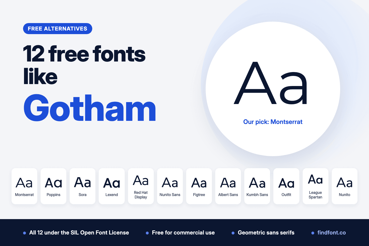
Gotham is a paid Hoefler&Co font with no free version. Montserrat, Poppins, Sora and Nunito are free OFL alternatives for logos, websites and Gotham Rounded.
Gotham started as a magazine job. In 2000, GQ asked Jonathan Hoefler and Tobias Frere-Jones's New York foundry for a new sans serif. Early copies went around as "GQ Sans", and the typeface first appeared in the magazine in 2001 (Hoefler&Co).
Hoefler&Co's credit today names Hoefler and Frere-Jones as the designers, with contributions from Jesse Ragan, Sara Soskolne and Andy Clymer. The foundry's earlier pages and the Museum of Modern Art's collection record credit Frere-Jones (MoMA).
The starting point was the lettering on the Port Authority Bus Terminal sign in New York, followed by a wider study of the city's building lettering. Hoefler&Co now describes the inspiration as the bold capitals on early twentieth-century posters, enamel signs and shop fronts across New York. The foundry says Gotham shares many traits of the geometric sans serifs, with a large lowercase, generous spacing and short ascenders and descenders that make it look big for its size (Hoefler&Co).
Barack Obama's 2008 presidential campaign used Gotham (Monotype), and MoMA added it to its permanent collection. Monotype bought Hoefler&Co in September 2021 (Monotype) and released a variable version of Gotham in May 2026.
Gotham is commercial software. Hoefler&Co sells separate licences for computers, websites and apps, and on 18 October 2026 its site listed the Gotham 1 package at $199 for one computer (typography.com). MyFonts and Adobe Fonts list it too. We found no free version from Hoefler&Co or Monotype. "Free Gotham" downloads on other sites don't come from the rights holder.
If you like Gotham's confident, straightforward look but can't buy a licence, these 12 free fonts from the findfont catalogue are the best places to start. All of them use the SIL Open Font License.
1. Montserrat
Best overall free alternative to Gotham
Montserrat has the closest backstory to Gotham of any free font. Julieta Ulanovsky based it on the old posters and signs of the Montserrat neighbourhood in Buenos Aires, lettering from the first half of the twentieth century. Gotham comes from the same kind of street lettering, in New York.
It also shares the two traits Hoefler&Co uses to describe Gotham. In our measurements Montserrat had a large x-height, 52.5% of the font size, and it set wide. The same sentence ran 13% longer than in Arial.
That width makes Montserrat strong in headlines, logos and short blocks of text. In long paragraphs it takes up a lot of room, so pair it with a calmer text face if your pages are text-heavy.
Use Montserrat for
- Logos and wordmarks
- Headlines and hero sections
- Posters and campaign graphics
- Brand identities
Montserrat is licensed under the SIL Open Font License 1.1. Preview and download Montserrat. For more unusual letter shapes, try its sister family Montserrat Alternates.
Verdict. Montserrat is the free font most people should try first when they want Gotham.
2. Poppins
Best for bold geometric headlines
Indian Type Foundry designed Poppins as a geometric sans serif for both Latin and Devanagari. Its letters are nearly monolinear and many are built from pure geometry, especially circles.
Poppins had the largest lowercase of the 12 fonts here. Its x-height measured 54.8% of the font size, and the test sentence ran 11.6% longer than in Arial. Big lowercase letters and wide spacing are exactly how Hoefler&Co describes Gotham.
Poppins is more strictly geometric than Gotham, which Jonathan Hoefler places between the geometric and grotesque traditions. On findfont it comes in nine weights from Thin to Black, with italics.
Use Poppins for
- Bold headlines
- Social media graphics
- Startup and app branding
- Hindi and English materials
Poppins is licensed under the SIL Open Font License 1.1. Preview and download Poppins.
Verdict. Poppins is the pick when you want Gotham's big, confident lowercase in a more geometric form.
3. Sora
Best for apps and websites
Jonathan Barnbrook and Julián Moncada designed Sora for the Sora project of the Japanese technology company Soramitsu. Its description points to a very big x-height and generous counters, which make it clear in app and web interfaces at any size.
Our measurements agree. Sora's x-height was 53.4% of the font size and the test sentence ran 13% longer than Arial. Of all the fonts here, Sora and Montserrat set widest.
Its description also mentions cues from early screen typography, which gives it a more digital feel than Gotham.
Use Sora for
- App interfaces
- Tech and fintech brands
- Landing pages
- Product marketing
Sora is licensed under the SIL Open Font License 1.1. Preview and download Sora.
Verdict. Sora brings Gotham's large, open proportions to screens.
4. Lexend
Best for readability
Bonnie Shaver-Troup created the Lexend project to reduce visual stress and improve reading performance. It was first designed with dyslexia and struggling readers in mind.
Lexend shares Gotham's large lowercase and wide setting. Its x-height measured 52.5% of the font size, the same as Montserrat, and the test sentence ran 9.7% longer than Arial.
Findfont also has the original wider Lexend families, such as Lexend Exa and Lexend Giga, which are more openly spaced by design. They're useful for spaced-out capitals in headings.
Use Lexend for
- Education and learning products
- Accessible websites
- Public information
- Children's and family brands
Lexend is licensed under the SIL Open Font License 1.1. Preview and download Lexend.
Verdict. Lexend gives you Gotham's open proportions with readability as its main goal.
5. Red Hat Display
Best American geometric alternative for display
Paula Scher at Pentagram commissioned Red Hat for the Red Hat identity, and Jeremy Mickel of MCKL designed it. Its description calls it a fresh take on the geometric genre, inspired by American sans serifs including Tempo and Highway Gothic.
That American geometric background is close to Gotham's. Red Hat Display is the headline version, with low contrast, tight spacing, a large x-height and open counters. It set slightly narrower than Arial in our test, so it's more compact than Montserrat.
For body text, use its companion Red Hat Text, which is narrower and more generously spaced.
Use Red Hat Display for
- Headlines and titles
- Corporate and tech brands
- Presentations
- Signage
Red Hat Display is licensed under the SIL Open Font License 1.1. Preview and download Red Hat Display.
Verdict. Red Hat Display is a compact, corporate cousin of Gotham.
6. Nunito Sans
Best all-round Gotham alternative for body text
Nunito Sans is the non-rounded member of the Nunito family. Vernon Adams started the project and Jacques Le Bailly extended it. Since 2023 it has been a variable font with weight, width, optical size and ascender axes.
That width axis matters if you used Gotham Narrow, because one Nunito Sans file can cover several widths. Its x-height measured 48.6% of the font size and the test sentence ran 1.4% longer than Arial, so it's more economical than Montserrat for paragraphs.
Use Nunito Sans for
- Website body text
- Reports and documents
- Interfaces
- Design systems that need several widths
Nunito Sans is licensed under the SIL Open Font License 1.1. Preview and download Nunito Sans.
Verdict. Nunito Sans is a practical Gotham substitute for text, with widths to spare.
7. Figtree
Best for buttons and labels
Erik Kennedy designed Figtree as a clean, friendly geometric sans for web and mobile apps. Its description says it still has punch in uppercase, which makes it good for buttons and short labels. The heavier weights get friendlier and suit headlines for personable brands.
Gotham's roots are in capital letters, so that uppercase strength is a useful overlap. Figtree measured 50% of the font size at x-height and set 1.1% longer than Arial.
Use Figtree for
- Buttons, tabs and labels
- Mobile apps
- Friendly brand headlines
- Landing pages
Figtree is licensed under the SIL Open Font License 1.1. Preview and download Figtree.
Verdict. Figtree works well where Gotham would be set in short, all-caps labels.
8. Albert Sans
Best for architecture and design studios
Andreas Rasmussen designed Albert Sans as a modern geometric sans inspired by Scandinavian architects and designers of the early twentieth century. Gotham started from architectural lettering in New York, so both fonts come from buildings rather than books.
Albert Sans measured 50% of the font size at x-height and set 4.2% longer than Arial. It supports over 200 languages.
Use Albert Sans for
- Architecture and interior studios
- Furniture and product brands
- Portfolios
- Exhibition graphics
Albert Sans is licensed under the SIL Open Font License 1.1. Preview and download Albert Sans.
Verdict. Albert Sans suits brands that want Gotham's architectural roots with a Nordic accent.
9. Kumbh Sans
Best workhorse for web and mobile
Saurabh Sharma designed Kumbh Sans as a multi-purpose geometric sans for web and mobile apps, with slight contrast in its strokes. Its x-height is set at two thirds of its cap height for legibility at any size, and our measurement confirmed that ratio.
The test sentence ran 5.6% longer than in Arial, so it sits between Gotham-wide fonts like Montserrat and compact ones like Red Hat Display.
On findfont, Kumbh Sans comes in six weights without italics.
Use Kumbh Sans for
- Web and mobile interfaces
- Startup websites
- Marketing pages
- Clean corporate material
Kumbh Sans is licensed under the SIL Open Font License 1.1. Preview and download Kumbh Sans.
Verdict. Kumbh Sans is a dependable middle-width option, as long as you don't need italics.
10. Outfit
Best compact alternative for tech brands
Outfit is the official typeface of the brand automation company outfit.io, inspired by the ligatures in its wordmark. It's a clean geometric sans.
Outfit is more compact than Montserrat or Sora. Its x-height was 47.5% of the font size and it set 0.9% narrower than Arial. That makes it useful where space is tight, such as navigation bars and mobile headers.
On findfont it comes in six weights without italics.
Use Outfit for
- Tech brand identities
- Navigation and headers
- App store graphics
- Product launches
Outfit is licensed under the SIL Open Font License 1.1. Preview and download Outfit.
Verdict. Outfit gives you a Gotham-like geometric voice in less space.
11. League Spartan
Best for heavy all-caps headlines
League Spartan is The League of Moveable Type's version of Matt Bailey's Spartan, which is based on early twentieth-century American geometric sans serifs. That's the same era and country as the lettering behind Gotham.
Its proportions are very different, though. The x-height measured just 41% of the font size, the smallest here, and the test sentence ran 7.7% shorter than Arial. In lowercase text it looks small and tight.
Use it for big, heavy, all-caps headlines.
Use League Spartan for
- All-caps headlines
- Posters
- Sports and event branding
- Bold logos
League Spartan is licensed under the SIL Open Font License 1.1. Preview and download League Spartan.
Verdict. League Spartan is for capitals. Don't use it for paragraphs.
12. Nunito
Best free alternative to Gotham Rounded
Hoefler&Co also sells Gotham Rounded, a version with rounded stroke ends. Nunito is the closest free answer on findfont. Vernon Adams created it as a sans serif with rounded terminals, and Jacques Le Bailly extended it to a full set of weights.
On findfont Nunito runs from Light to ExtraBold with italics, so it can carry a full brand system. Its x-height measured 49.3% of the font size.
If you only need one weight for a logo or heading, Varela Round is another option. It has a larger x-height, 51.5% of the font size, but comes in Regular only.
Use Nunito for
- Friendly brand identities
- Children's and education products
- Health and wellness apps
- Packaging
Nunito is licensed under the SIL Open Font License 1.1. Preview and download Nunito.
Verdict. Nunito is the free font to try when the brief says Gotham Rounded.
Which free font is closest to Gotham?
Gotham is a commercial font and we didn't measure it, so this comparison uses the two traits in Hoefler&Co's own description, a large lowercase and generous spacing. Here is how the alternatives compare on those two traits, with Arial as a familiar reference.
| Font | x-height, share of font size | Same sentence vs Arial |
|---|---|---|
| Poppins | 54.8% | +11.6% |
| Sora | 53.4% | +13.0% |
| Montserrat | 52.5% | +13.3% |
| Lexend | 52.5% | +9.7% |
| Varela Round | 51.5% | +7.3% |
| Red Hat Display | 50.1% | -0.8% |
| Figtree | 50.0% | +1.1% |
| Albert Sans | 50.0% | +4.2% |
| Nunito | 49.3% | +1.5% |
| Kumbh Sans | 48.8% | +5.6% |
| Nunito Sans | 48.6% | +1.4% |
| Outfit | 47.5% | -0.9% |
| League Spartan | 41.0% | -7.7% |
| Arial, for reference | 51.9% | 0.0% |
We measured the Regular weight of each font, with variable fonts set to weight 400, using the sentence "The quick brown fox jumps over the lazy dog". Measured on 18 October 2026.
Montserrat, Sora, Poppins and Lexend are the four that combine a large lowercase with wide spacing.
For the closest overall match, choose Montserrat.
For bold geometric headlines, choose Poppins.
For apps and websites, choose Sora.
For readability, choose Lexend.
For body text, choose Nunito Sans.
For Gotham Rounded, choose Nunito.
Gotham versus Montserrat
Montserrat is our top pick for Gotham, but they are still different typefaces.
Both draw on early twentieth-century urban lettering, Gotham from New York and Montserrat from Buenos Aires. Both have a large lowercase and a wide, open fit.
The families differ most. Hoefler&Co sells Gotham in four widths, Regular, Narrow, Extra Narrow and Condensed, each with eight weights from Thin to Ultra plus italics (Hoefler&Co). Montserrat on findfont has one width, from Light to ExtraBold with italics.
In practical terms:
- Montserrat can replace Gotham in logos, headlines and short text.
- Montserrat can't replace Gotham Narrow or Condensed on its own.
- For a narrower style, use Nunito Sans's width axis or pair Montserrat with a condensed family.
- For long paragraphs, Nunito Sans or Figtree will use less space.
Can these fonts be used commercially?
Yes. Every font in this list is published on findfont under the SIL Open Font License 1.1. The licence says fonts can be "used, studied, modified and redistributed freely as long as they are not sold by themselves" (OFL).
That covers logos, websites, apps, packaging, ads and client work. You can self-host the files and bundle them in software. Two limits apply:
- You can't sell the font files on their own.
- If you modify a font that has a Reserved Font Name, your version needs a new name.
Gotham needs a licence for each kind of use. Hoefler&Co sells desktop licences by the number of computers, website licences by monthly pageviews, and app licences by request, under its end user licence agreement.
Always check the licence file that comes with any font you download.
How to choose the right Gotham alternative
Start with the capitals
Gotham grew out of capital letters on signs. Type your brand name or headline in capitals and compare those first.
Then check the lowercase
Some fonts that look right in caps fall apart in lowercase. League Spartan has a small lowercase. Poppins has a large one. Set a full sentence before you decide.
Watch the width
Montserrat, Sora and Poppins take up a lot of room. That's great for a logo and expensive for a long article. If space matters, look at Red Hat Display, Outfit or Nunito Sans.
Check the family
Kumbh Sans, Outfit and League Spartan have no italics on findfont, and Varela Round has one weight. If you need Gotham Narrow or Condensed, look for width axes or a condensed partner.
Compare side by side
Type your brand name into the findfont compare tool. That link opens six of the fonts above with the same text. You can compare up to 10 at once.
Final recommendation
Montserrat is the best free Gotham alternative for most projects. It comes from the same kind of street lettering, and it has the large lowercase and wide spacing that define Gotham.
Choose Poppins for bold geometric headlines, Sora for apps and websites, Lexend when readability comes first, Nunito Sans for body text and Nunito when the brief says Gotham Rounded.
If you're also weighing up a softer geometric look, see our guide to free alternatives to Avenir.
Frequently asked questions
Is Gotham a free font?
No. Gotham is a commercial typeface sold by Hoefler&Co, which Monotype owns. It needs a licence for computers, websites or apps. We found no free version from the rights holder.
What Google font is closest to Gotham?
Montserrat is our pick. It has a similar origin in early twentieth-century street lettering, a large lowercase and a wide fit.
What is a free alternative to Gotham Rounded?
Nunito. It has rounded stroke ends and a full range of weights with italics. Varela Round is another option if you only need one weight.
Who designed Gotham?
Hoefler&Co credits Jonathan Hoefler and Tobias Frere-Jones, with contributions from Jesse Ragan, Sara Soskolne and Andy Clymer. Earlier foundry pages and MoMA credit Tobias Frere-Jones.
Is Montserrat the same as Gotham?
No. They're different designs that share a large lowercase, wide spacing and roots in early twentieth-century city lettering.
Can I use Gotham on my website?
Only with a web licence from Hoefler&Co or one of the stores that sell it. Websites need their own licence, separate from the desktop licence for computers.
What font did Obama's 2008 campaign use?
Gotham. Monotype names Barack Obama's 2008 presidential campaign among Gotham's best-known uses.
More free font alternatives
- Free alternatives to Arial
- Free alternatives to Segoe UI
- Free alternatives to Aptos
- Free fonts similar to Helvetica
- Free alternatives to Avenir
- Free fonts similar to SF Pro
Sources
- Hoefler&Co, Gotham design notes. Credits, GQ origin, first use in 2001, New York inspiration, geometric traits.
- Hoefler&Co, How to use Gotham. Large lowercase, generous fit, short ascenders and descenders, four widths and eight weights.
- Hoefler&Co, Gotham styles and licences. Licence types and the $199 Gotham 1 price, seen 18 October 2026.
- Hoefler&Co, End user licence agreement.
- Jonathan Hoefler, The history of the Gotham font. GQ commission and the Port Authority sign.
- Museum of Modern Art, Tobias Frere-Jones, Gotham, 2000. Collection record and Port Authority origin.
- Monotype, Monotype announces acquisition of Hoefler&Co, 15 September 2021.
- Monotype, Monotype celebrates 25 years of Gotham, 12 May 2026. Gotham Variable.
- Monotype, Knockout and Gotham express new brand identity for NYC Pride, 2022. Obama 2008 campaign.
- MyFonts, Gotham.
- SIL, Open Font License official text.
- Free font descriptions: each family's description file in the google/fonts repository.
- Measurements: findfont, 18 October 2026, using fontTools on the free font files from the findfont catalogue.