12 Best Free Alternatives to Aptos in 2026
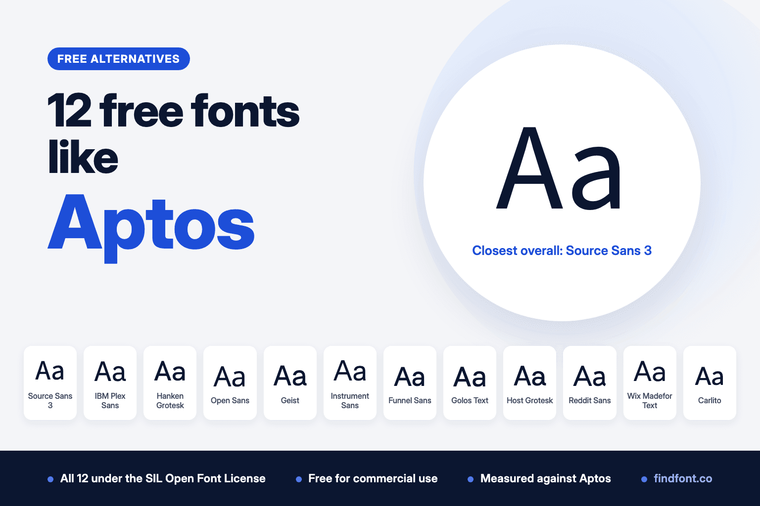
Aptos is a free Microsoft download, but you can't self-host or redistribute it. We measured 12 free OFL fonts against Aptos. Source Sans 3 came out closest.
If a new Word document looks slightly different from the ones you made a few years ago, Aptos is why. Microsoft began rolling it out as the default font in Word, Outlook, PowerPoint and Excel in July 2023, replacing Calibri, which had held the job since 2007 (Microsoft Design). It reached Microsoft 365's Current Channel in January 2024 (Microsoft 365 release notes).
Steve Matteson designed it. While Microsoft tested it as a candidate, it was called Bierstadt, after one of Colorado's 14,000-foot peaks (Microsoft Design, 2021). Matteson later renamed it after Aptos, California. Microsoft describes Aptos as a precise, contemporary sans serif inspired by mid-twentieth-century Swiss typography, with clear-cut stroke endings (Microsoft). Matteson has said Microsoft asked for a grotesque sans serif, and that he added organic touches to make it feel more human.
Is Aptos free?
Partly, and the difference matters.
Since June 2024, Microsoft has offered the Aptos fonts as a free download from its Download Center, so people can install them for apps that can't reach Office's online font service (Microsoft Download Center). That makes Aptos free to get.
It doesn't make Aptos open source. The font files in the free download carry the same licence text as the copies Microsoft 365 installs. That text says you may use the font to create, display and print content, embed it only as its embedding settings allow, and temporarily send it to a printer. It ends with "Any other use is prohibited."
Use, distribution and embedding are separate questions. The download's licence agreement lets you install and use the fonts on your own devices, and it gives you no right to distribute them. Embedding is set inside the font itself. Aptos is marked for editable embedding, which the OpenType specification defines as letting a document carry the font so others can open, edit and save it (OpenType OS/2 specification). So a Word file you send can include Aptos.
Microsoft sells web, app and other licences for Aptos through Monotype's MyFonts store.
So you can write a report in Aptos. You can't self-host it on your website, bundle it in an app or include it in a template you sell without buying a licence. For those jobs you need a free font with an open licence.
We picked 12 free fonts from the findfont catalogue, all under the SIL Open Font License, and measured each one against Aptos. The results are in "Which free font is closest to Aptos?" below.
One thing to know before you start. Aptos has a small x-height. Its lowercase x measured 0.476 of the font size, against 0.519 for Arial and 0.500 for Segoe UI. Most free alternatives look bigger than Aptos at the same point size, so you will often need to set them a little smaller.
1. Source Sans 3
Best overall free alternative to Aptos
Source Sans was Adobe's first open-source type family, designed by Paul D. Hunt to work well in user interfaces. Source Sans 3 is the current version.
It was the closest match in our measurements. The x-height was 2.2% taller than Aptos and the test sentence ran 1.4% shorter. Swap one for the other at the same size and your pages will look and paginate much the same.
On findfont, Source Sans 3 runs from Light to ExtraBold with italics, which covers what most documents and interfaces need.
Use Source Sans 3 for
- Reports and long documents
- Websites that used to specify Aptos
- App and dashboard interfaces
- Slide decks
Source Sans 3 is licensed under the SIL Open Font License 1.1. Preview and download Source Sans 3.
Verdict. Source Sans 3 is the easiest swap for Aptos at the same size.
2. IBM Plex Sans
Closest to Aptos's mix of grotesque and human warmth
Mike Abbink designed IBM Plex with the Dutch foundry Bold Monday. Its description calls it a neutral, yet friendly grotesque. That is close to the brief Matteson described for Aptos, a grotesque sans serif with organic touches.
Plex looks bigger. Its x-height measured 8.5% taller than Aptos, so set it at about 11pt where you would use Aptos at 12pt. At that size, text runs 2.6% shorter than in Aptos.
The Plex family also includes a serif and a monospace, much like Aptos Serif and Aptos Mono.
Use IBM Plex Sans for
- Corporate documents and reports
- Technical writing
- Enterprise software
- Brand systems that need sans, serif and mono
IBM Plex Sans is licensed under the SIL Open Font License 1.1. Preview and download IBM Plex Sans.
Verdict. IBM Plex Sans is the best character match if you're happy to resize.
3. Hanken Grotesk
Best for a classic grotesque look
Hanken Grotesk is inspired by the classic grotesques, with geometry, metrics and OpenType features updated for signage, books, magazines, interfaces and apps.
It sits close to Aptos in size. The x-height measured 3.7% taller and the test sentence 6.7% longer, so text will take up slightly more room.
If Aptos appeals to you because of its Swiss and grotesque roots, Hanken Grotesk keeps that feel in a free family.
Use Hanken Grotesk for
- Brand identities
- Editorial layouts
- Signage
- Websites and apps
Hanken Grotesk is licensed under the SIL Open Font License 1.1. Preview and download Hanken Grotesk.
Verdict. Hanken Grotesk is a good pick for design work that grew out of an Aptos document.
4. Open Sans
From the same designer as Aptos
Steve Matteson also designed Open Sans. Google describes it as a humanist sans serif with upright stress, open forms and a neutral, friendly look, made for print, web and mobile interfaces.
It's more humanist than Aptos and much larger. Its x-height measured 12.5% taller, which means Open Sans at about 10.7pt looks the same size as Aptos at 12pt. Once matched that way, text ran 1.8% shorter than Aptos.
Use Open Sans for
- Websites and apps
- Multilingual documents
- Help centres and support content
- Forms
Open Sans is licensed under the SIL Open Font License 1.1. Preview and download Open Sans.
Verdict. A safe, familiar choice from the same hand as Aptos, as long as you size it down.
5. Geist
Best Swiss-style alternative for headlines
Vercel created Geist with Basement Studio. Its description says it draws on the Swiss design movement and works best at large display sizes, for headlines, logos and posters.
That Swiss influence links it to Aptos. Geist is much bigger though, with an x-height 11.4% taller. Matched by x-height, its line length was within 1% of Aptos.
Findfont has Geist without italics, so it can't carry a whole document on its own. Use it for headings and pair it with a text family.
Use Geist for
- Headlines and titles
- Presentations
- Developer and tech brands
- Posters
Geist is licensed under the SIL Open Font License 1.1. Preview and download Geist.
Verdict. Geist is a headline font with Aptos's Swiss leaning.
6. Instrument Sans
Best for flexible brand typography
Instrument made Instrument Sans for its own brand, drawing on its interest in neo-grotesques. It's variable on weight and width, has italics and comes with 12 stylistic sets that swap common letters for alternates.
The x-height measured 7.2% taller than Aptos. Matched by x-height, line length was within 1%.
Those stylistic sets let you tune the font's personality, which is useful if you want something more distinctive than Aptos without leaving the grotesque family.
Use Instrument Sans for
- Brand identities
- Marketing sites
- Editorial headlines
- Product interfaces
Instrument Sans is licensed under the SIL Open Font License 1.1. Preview and download Instrument Sans.
Verdict. Choose Instrument Sans when you want Aptos's neutrality with more room to customise.
7. Funnel Sans
Best for data-heavy documents
NORD ID and Kristian Möller developed Funnel Sans for Funnel. Its letters mix square and circular shapes inspired by the movement and shapes of data points.
Aptos is now the default in Excel too, so charts and spreadsheets made in Microsoft 365 often use it. Funnel Sans is a natural free replacement in that setting.
It measured 5.1% taller than Aptos at x-height and 6.5% longer on the test sentence.
Use Funnel Sans for
- Dashboards and charts
- Data reports
- Analytics products
- Tech marketing
Funnel Sans is licensed under the SIL Open Font License 1.1. Preview and download Funnel Sans.
Verdict. Funnel Sans suits numbers and charts that used to be set in Aptos.
8. Golos Text
Best for public-service and long-form web text
Alexandra Korolkova and Vitaly Kuzmin designed Golos, and ParaType released it in 2019. It was commissioned for state and social service websites, and Golos Text is the version for continuous reading on screen.
It runs large. The x-height measured 11.4% taller than Aptos and the test sentence 13.6% longer, so size it down when you switch.
On findfont, Golos Text has five weights, without italics.
Use Golos Text for
- Government and public-service sites
- Long articles on screen
- Cyrillic and Latin content
- Service interfaces
Golos Text is licensed under the SIL Open Font License 1.1. Preview and download Golos Text.
Verdict. Golos Text is built for reading on screen, which Aptos's documents often end up doing.
9. Host Grotesk
Best for interfaces where text changes weight
Element Type designed Host Grotesk as a uniwidth font for modern interfaces. Every weight has the same letter widths, so making text bold doesn't push it onto a new line or change a button's size.
The x-height measured 4.3% taller than Aptos, and the test sentence ran 11.2% longer. It sets wide.
Use Host Grotesk for
- Buttons and navigation
- Interfaces with hover states
- Tables where bold rows must stay aligned
- Product dashboards
Host Grotesk is licensed under the SIL Open Font License 1.1. Preview and download Host Grotesk.
Verdict. Host Grotesk solves a real interface problem that Aptos doesn't.
10. Reddit Sans
Best friendly humanist alternative
Reddit Sans is a humanist sans serif designed for Reddit, with Reddit Sans Condensed and Reddit Mono as companions.
Microsoft describes Aptos as having a slight humanist touch. Reddit Sans leans further that way. Its x-height measured 8.8% taller than Aptos. Matched by x-height, its line length was 2% shorter.
Use Reddit Sans for
- Community and social products
- Friendly app interfaces
- Newsletters
- Consumer brands
Reddit Sans is licensed under the SIL Open Font License 1.1. Preview and download Reddit Sans.
Verdict. Reddit Sans is the warmer option if Aptos feels a little cool.
11. Wix Madefor Text
Best for distinctive italics
Dalton Maag designed Wix Madefor for Wix. The text family has interface weights with matching italics whose shapes come from cursive writing, even though the upright letters are geometric.
Aptos takes italics seriously too. Microsoft says its italics were redrawn rather than simply slanted. If your documents lean on italics, Wix Madefor Text is a good free match for that habit.
It measured 3.5% taller than Aptos at x-height and 9.8% longer on the test sentence.
Use Wix Madefor Text for
- Website body text
- Product interfaces
- Editorial content with italics
- Brand copy
Wix Madefor Text is licensed under the SIL Open Font License 1.1. Preview and download Wix Madefor Text.
Verdict. Pick Wix Madefor Text when italics are part of your voice.
12. Carlito
Best for documents that started in Calibri
Carlito is derived from Lato and is metrically compatible with Calibri, the Office default before Aptos. Because its characters have the same widths as Calibri's, a document set in Calibri keeps the same line lengths when you switch it to Carlito.
It also matches Aptos's x-height almost exactly, 0.4% taller in our measurement, with text running 3.6% shorter. If you have a mix of older Calibri files and newer Aptos files, Carlito keeps the old ones intact and sits comfortably next to the new ones.
On findfont Carlito has Regular and Bold with italics.
Use Carlito for
- Old Office documents set in Calibri
- Mixed archives of Calibri and Aptos files
- LibreOffice and Google Docs work shared with Word users
- Reports and letters
Carlito is licensed under the SIL Open Font License 1.1. Preview and download Carlito.
Verdict. Carlito is the right tool for files made before Aptos arrived.
Which free font is closest to Aptos?
There's no free metric-compatible copy of Aptos, so pick by what you need to keep.
For the closest size and line length, choose Source Sans 3.
For the closest character, choose IBM Plex Sans.
For the same designer, choose Open Sans.
For a classic grotesque look, choose Hanken Grotesk.
For headlines with a Swiss feel, choose Geist.
For old Calibri documents, choose Carlito.
Our measurements
We measured the Regular weight of each font against Aptos Regular, version 2.01, the copy installed with Microsoft Word. Variable fonts were set to weight 400 with every other axis at its default. We compared the height of the lowercase x and the width of the sentence "The quick brown fox jumps over the lazy dog" at the same font size. The last column compares width again after scaling each font to Aptos's x-height, which shows how text length changes once you resize the replacement to look the same size.
| Font | x-height vs Aptos | Same sentence, same size | Same sentence, x-height matched |
|---|---|---|---|
| Source Sans 3 | +2.2% | -1.4% | -3.6% |
| Carlito | +0.4% | -3.6% | -4.0% |
| Hanken Grotesk | +3.7% | +6.7% | +3.0% |
| Funnel Sans | +5.1% | +6.5% | +1.3% |
| IBM Plex Sans | +8.5% | +5.6% | -2.6% |
| Wix Madefor Text | +3.5% | +9.8% | +6.2% |
| Instrument Sans | +7.2% | +8.1% | +0.8% |
| Reddit Sans | +8.8% | +6.7% | -2.0% |
| Host Grotesk | +4.3% | +11.2% | +6.6% |
| Geist | +11.4% | +10.7% | -0.6% |
| Open Sans | +12.5% | +10.5% | -1.8% |
| Golos Text | +11.4% | +13.6% | +2.0% |
Measured on 18 October 2026.
None of these fonts is metrically compatible with Aptos. Expect line breaks and page counts to shift a little when you switch.
Can these fonts be used commercially?
Yes. Every font in this list is published on findfont under the SIL Open Font License 1.1. The licence says fonts can be "used, studied, modified and redistributed freely as long as they are not sold by themselves" (OFL).
You can use them in client work, logos, ads, websites and apps. You can self-host the files and bundle them in software, including templates. Two limits apply:
- You can't sell the font files on their own.
- If you modify a font that has a Reserved Font Name, your version needs a new name.
Aptos is more limited, as covered above. The licence inside the font files allows creating, displaying and printing content and nothing else, and Microsoft sells separate web and app licences through MyFonts.
Always check the licence file that comes with any font you download.
How to choose the right Aptos alternative
Decide where the font will live
If it's only going into Word documents on computers with Microsoft 365, you may not need an alternative at all. If it's going on a website, into an app or into a template you share or sell, you need an open licence.
Match the size before you compare
Aptos is small for its point size. Open Sans, Geist and Golos Text look much bigger at 12pt. Resize until the lowercase letters match, then compare.
Check the family
Aptos comes with six weights and italics, plus narrow and display styles. Geist, Golos Text and Host Grotesk need checking for italics, and Carlito has only two weights. Make sure your choice covers the styles your documents use.
Think about your old files
If you have years of Calibri documents, Carlito keeps them intact. Use one of the other fonts for new work.
Compare side by side
Type a paragraph from your own document into the findfont compare tool. That link opens six of the fonts above. You can compare up to 10 at once.
Final recommendation
Source Sans 3 is the best free alternative to Aptos for most people. It matches Aptos's size and line length closely and comes with the weights a document needs.
Choose IBM Plex Sans for the closest character, Open Sans for a font by the same designer, Hanken Grotesk for a classic grotesque look and Carlito for anything that started life in Calibri.
Aptos is a fine font, and it's free to download. It just isn't free to put on your website. For that, any of these 12 will do the job.
Frequently asked questions
Is Aptos a free font?
Aptos is free to download from Microsoft, but it isn't open source. The free download carries the same licence text as the copies Microsoft 365 installs. You can install and use it on your own devices, but you get no right to distribute the font files. Documents can embed it, because the font allows editable embedding. Web and app licences are sold through MyFonts.
Can I use Aptos on my website?
Not by uploading the font files to your server under the free download's terms. You'd need a web licence from MyFonts. A free font such as Source Sans 3 or IBM Plex Sans avoids the problem.
What font replaced Calibri?
Aptos. Microsoft began making it the default font in Microsoft 365 apps in July 2023, and it reached the Current Channel in January 2024.
Who designed Aptos?
Steve Matteson designed Aptos for Microsoft. Its working name was Bierstadt.
What Google font is closest to Aptos?
Source Sans 3 was closest in our measurements, within 2.2% on x-height and 1.4% on line length. IBM Plex Sans is the closest in character.
Does Windows 11 include Aptos?
Microsoft lists Office apps as the products that supply Aptos, and it's also on the Microsoft Download Center. We found no Microsoft source saying Windows itself includes it.
What is a free alternative to Calibri?
Carlito. It's metrically compatible with Calibri, so documents keep their layout.
More free font alternatives
- Free alternatives to Arial
- Free alternatives to Segoe UI
- Free alternatives to Gotham
- Free fonts similar to Helvetica
- Free alternatives to Avenir
- Free fonts similar to SF Pro
Sources
- Microsoft Learn, Aptos font family. Designer, design description, styles, products that supply the font.
- Microsoft Design, A change of typeface: Microsoft's new default font has arrived, 19 July 2023. Rollout, Calibri replacement, renaming from Bierstadt to Aptos.
- Microsoft Design, Beyond Calibri: finding Microsoft's next default font, 28 April 2021. Calibri as default since 2007, Bierstadt name, Matteson on the grotesque brief.
- Microsoft Learn, Microsoft 365 Apps Current Channel release notes. Version 2312, 4 January 2024.
- Microsoft Download Center, Microsoft Aptos Fonts. Published 4 June 2024. Its Aptos.ttf carries the same licence text as the Microsoft 365 copy, and the download's licence agreement allows installing and using the fonts on your devices with no distribution rights.
- MyFonts, Aptos. Licence types.
- Licence text embedded in Aptos.ttf, version 2.01, as installed with Microsoft Word, and the same text in the Download Center copy.
- Microsoft Learn, OpenType OS/2 table specification. fsType 0x0008, editable embedding.
- SIL, Open Font License official text.
- Free font descriptions: each family's description file in the google/fonts repository.
- Measurements: findfont, 18 October 2026, using fontTools on the font files described above.