10 Best Free Alternatives to Proxima Nova in 2026
Proxima Nova isn't free, but its look is. We measured 10 free Google Fonts against Proxima Nova itself, and Montserrat, the usual answer, isn't the closest.
Proxima Nova is one of the most used fonts on the web. Mark Simonson released an early version, Proxima Sans, in 1994. He then redrew nearly every character, and Proxima Nova came out in 2005 (Mark Simonson Studio). Adobe Fonts describes it as a font that "bridges the gap between typefaces like Futura and Akzidenz Grotesk" (Adobe Fonts). In practice that means geometric shapes with the more even proportions of a classic grotesque.
Its story is tied to Gotham's. Gotham reached the public in 2002, and Simonson writes that it was strikingly similar. Jonathan Hoefler later told him that when Hoefler & Frere-Jones first saw Proxima Sans in Rolling Stone, they took it for Gotham (Mark Simonson Studio). If you're choosing between the two looks, see our free alternatives to Gotham too.
Proxima Nova took off on the web after Typekit added it in 2009 (Mark Simonson Studio), and the foundry says it has been the most widely used commercial web font since 2010 (Mark Simonson Studio). In 2015 BuzzFeed, Mashable, NBC News and Wired all used it (Mic), and TikTok used it until it switched to its own TikTok Sans in 2023 (The Verge). The family now has 80 fonts: eight weights from Thin to Black, five widths, and italics.
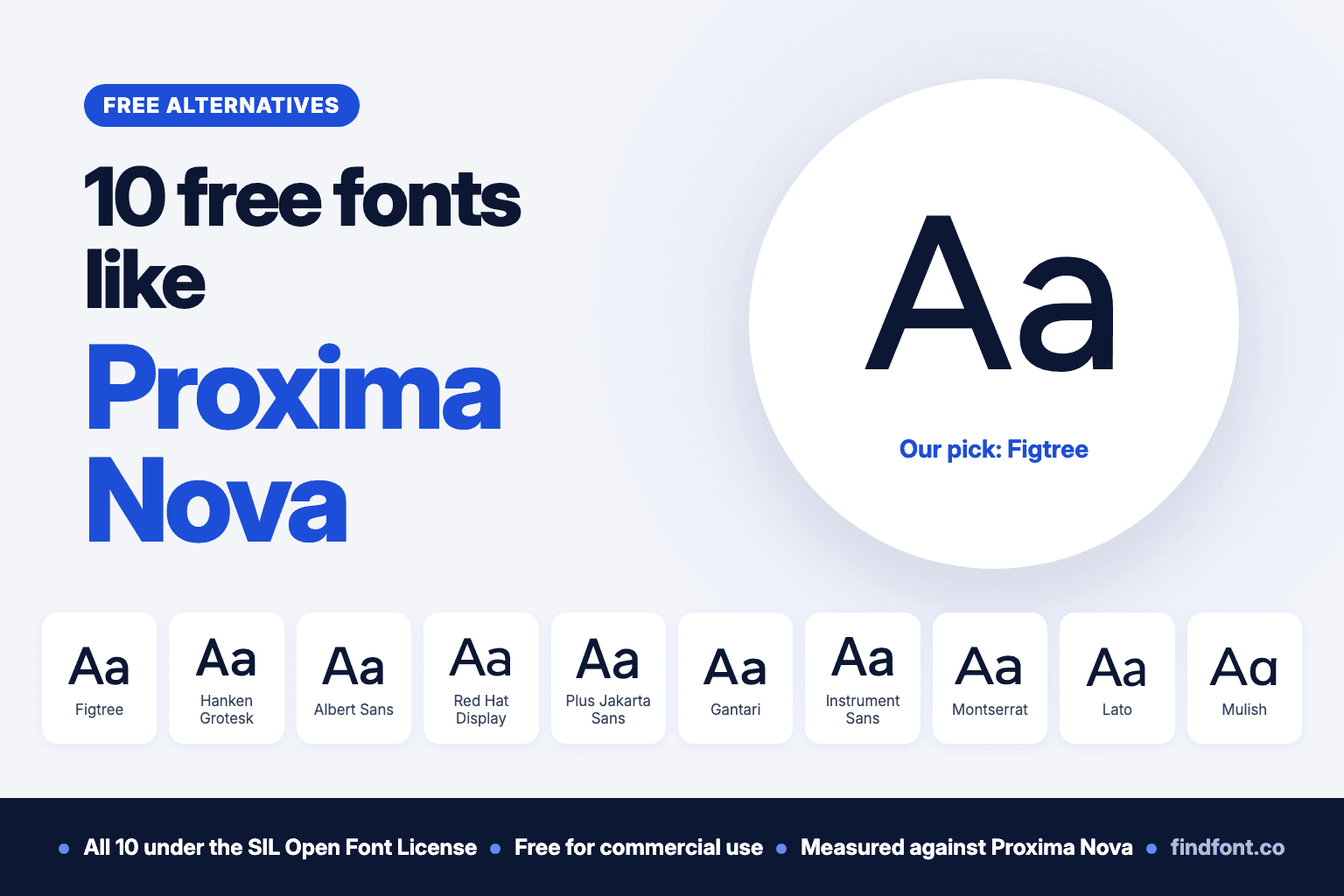
Short answer: the closest free font to Proxima Nova is Figtree. It has nearly the same proportions, the same basic letter shapes and almost the same spacing. Montserrat, the most common "Google font like Proxima Nova" answer, is number 8 here: close in spirit, but noticeably wider.
Proxima Nova is commercial. On 23 October 2026, Mark Simonson Studio sold single styles from $39.99 and the 80-style family from $975.99 (Mark Simonson Studio). It's included in Adobe Fonts with paid Creative Cloud plans, but there's no free version and it isn't on Google Fonts.
If you want Proxima Nova's look without buying a licence, these 10 free fonts from the findfont catalogue are the best places to start. All of them use the SIL Open Font License, so you can use them commercially. Unlike most lists, we measured each one against Proxima Nova itself. We don't have Proxima Nova installed, so we measured it as the foundry's own website loads it: Mark Simonson Studio's Proxima Nova page uses the family as web fonts, and we read the letter sizes from those in the browser. The full comparison is in the table after the list.
1. Figtree
Best overall free alternative to Proxima Nova
Erik Kennedy designed Figtree in 2022 as a friendly geometric sans serif for apps and websites (Google Fonts). He also writes about Proxima Nova alternatives, and in that guide he says Figtree's capitals take inspiration from Proxima Nova and Gotham (Learn UI Design).
Our measurements agree. Taken together, Figtree's numbers were the closest of any font we measured, though it doesn't win every single measure. Proxima Nova's lowercase is 72.4% as tall as its capitals, and Figtree's is 71.4%. Its ascenders, the tops of letters like d and h, stop at the height of the capitals, which is one of Proxima Nova's quieter habits. Sized so its lowercase matched Proxima Nova's, the same sentence was only 1.6% shorter.
The letters match too. Figtree has a two-storey "a", a single-storey "g", a y with a straight tail and a Q whose tail cuts across the bowl, as Proxima Nova does. Proxima Nova also offers a round, single-storey "a" as an alternate: stylistic set 4 changes only the "a", and set 1 changes it along with the l and y. Figtree has the same round "a" in its stylistic set 1 (ss01), which changes nothing else.
- In CSS:
font-feature-settings: "ss01"; - In Figma: open Type settings, then Details, then Stylistic sets.
- In Adobe Illustrator: open the OpenType panel, then Stylistic Sets, then Set 1.
Use Figtree for
- Websites and apps that used Proxima Nova
- Interfaces, dashboards and product pages
- Brand identities that need a full family with italics
Figtree comes in weights from Light to Black, with italics. It's licensed under the SIL Open Font License 1.1. Preview and download Figtree.
Verdict. If you only try one, try Figtree.
2. Hanken Grotesk
Best for body text with Proxima Nova's spacing
Alfredo Marco Pradil designed Hanken Grotesk as a sans serif inspired by the classic grotesques (Google Fonts).
It sets almost exactly as long as Proxima Nova. Sized to the same lowercase height, the same sentence ran only 0.2% longer, the closest line length of any font we measured. Its ascenders also stop at cap height. Its round letters are a little narrower than Proxima Nova's, which makes it look slightly more like a classic grotesque and a little less geometric.
Use Hanken Grotesk for
- Long text on websites and in reports
- Product interfaces and documentation
- Teams that want Proxima Nova's rhythm with a calmer look
Hanken Grotesk comes in weights from Thin to Black, with italics. It's licensed under the SIL Open Font License 1.1. Preview and download Hanken Grotesk.
Verdict. The best choice when line length matters more than headline character.
3. Albert Sans
Best all-rounder for brands
Andreas Rasmussen released Albert Sans in 2021 (GitHub). It's inspired by early 20th-century Scandinavian architects and designers (Google Fonts).
It has Figtree's proportions, with lowercase 71.4% as tall as its capitals, and sized to Proxima Nova's lowercase its sentence ran 1.5% longer. Its round letters are close to Proxima Nova's too. Two details give it away. Its ascenders rise about 3% above the capitals, and its Q has a short vertical tail at the bottom instead of a diagonal one.
Use Albert Sans for
- Brand identities and marketing sites
- Headlines and subheads
- Presentations
Albert Sans comes in weights from Thin to Black, with italics. It's licensed under the SIL Open Font License 1.1. Preview and download Albert Sans.
Verdict. A safe, friendly swap, especially if you don't use many capital Qs.
4. Red Hat Display
Best drop-in at the same font size
Jeremy Mickel of MCKL designed Red Hat Display with Pentagram for Red Hat's 2019 identity (Google Fonts). Its inspiration was American sans serifs such as Tempo and Highway Gothic, the US road-sign lettering. Simonson lists the US highway signage typeface among the influences on the design that became Proxima Nova (Mark Simonson Studio).
If you replace Proxima Nova with Red Hat Display and keep the same font size, the same sentence takes up the same space: our measurement came out 0.0% different. Its lowercase is 71.6% as tall as its capitals, close to Proxima Nova's 72.4%. The catch is size. At the same font size its lowercase is about 4% taller than Proxima Nova's and its capitals about 5% taller, so it looks slightly bigger and a little tighter.
Use Red Hat Display for
- Headlines and hero sections
- Replacing Proxima Nova in an existing layout without reflowing text
- Tech and B2B brands
Red Hat Display comes in weights from Light to Black, with italics. It's licensed under the SIL Open Font License 1.1. Preview and download Red Hat Display.
Verdict. The easiest swap when you can't change your font sizes.
5. Plus Jakarta Sans
Closest proportions, in a crisper style
Gumpita Rahayu of Tokotype designed Plus Jakarta Sans in 2020 for the +Jakarta city identity. Google Fonts lists Neuzeit Grotesk, Futura and 1930s grotesques as its inspiration (Google Fonts).
Of the ten, it has the proportions closest to Proxima Nova's: its lowercase is 71.9% as tall as its capitals. It's a bigger font, though. At the same font size its capitals are about 12% taller than Proxima Nova's, and sized down to match, it sets 5.5% narrower. It looks more condensed and more modern.
Use Plus Jakarta Sans for
- Apps and startup brands
- Headlines that need to fit in tight spaces
- Packaging and social graphics
Plus Jakarta Sans comes in weights from ExtraLight to ExtraBold, with italics. It's licensed under the SIL Open Font License 1.1. Preview and download Plus Jakarta Sans.
Verdict. Proxima Nova's proportions with tighter, sharper letters.
6. Gantari
Same capital height as Proxima Nova
Anugrah Pasau of Lafontype released Gantari in 2022, a sans serif with what Google Fonts calls a geometric touch (Google Fonts).
Its capitals are the same height as Proxima Nova's at the same font size: 0.668 of the font size against 0.667. Its lowercase is slightly smaller, 70.4% of its capitals, and its ascenders stop at cap height. It's wider, though: at the same font size the sentence ran 4.2% longer. In bold, its strokes are almost exactly as thick as Proxima Nova Bold's, measured against the height of the capitals.
Use Gantari for
- Logos and short headlines
- Bold display text
- Designs where capitals must line up with existing Proxima Nova artwork
Gantari comes in weights from Thin to Black, with italics. It's licensed under the SIL Open Font License 1.1. Preview and download Gantari.
Verdict. A good match for Proxima Nova's capitals and bold strokes, if you can give it a little more room.
7. Instrument Sans
Best free alternative to Proxima Nova Condensed
Rodrigo Fuenzalida and Jordan Egstad designed Instrument Sans for the Instrument brand, as a neo-grotesque with a width axis. It was added to Google Fonts in 2023 (Google Fonts).
At its normal width it's close to Proxima Nova: lowercase 70.8% as tall as the capitals, ascenders at cap height, and a sentence 1.9% shorter once the lowercase is matched. The width axis is what sets it apart. At 87% width, its line length came within about 0.2% of Proxima Nova Condensed's in our test. In CSS, that's font-stretch: 87%; with the variable font.
Use Instrument Sans for
- Editorial layouts and magazines
- Narrow columns, tables and sidebars
- Replacing Proxima Nova Condensed
Instrument Sans comes in weights from Regular to Bold, with italics. It's licensed under the SIL Open Font License 1.1. Preview and download Instrument Sans.
Verdict. The one to pick when you also need a condensed width.
8. Montserrat
The popular answer, best for wide headlines
Julieta Ulanovsky based Montserrat on the old posters and signs of the Montserrat neighbourhood in Buenos Aires, and released it in 2011 (Google Fonts).
Montserrat is the font most often suggested as a free Proxima Nova: all eight of the popular Proxima Nova alternative lists we checked include it. It has a similar feel, but it isn't the closest. Its lowercase is larger, 75.1% of its capitals, its ascenders rise 6% above them, and its round letters are slightly wider than they are tall. At the same font size, our sentence ran 14.2% longer than in Proxima Nova. Even sized to the same lowercase height, it was 5% longer.
Use Montserrat for
- Big, wide headlines
- Logos and posters
- Designs that already use Montserrat elsewhere
Montserrat comes in weights from Thin to Black, with italics. It's licensed under the SIL Open Font License 1.1. Preview and download Montserrat.
Verdict. Good for headlines, but too wide to be a true Proxima Nova replacement in text.
9. Lato
The warm, classic choice
Łukasz Dziedzic began Lato in 2010 as a corporate identity commission. When the client went in another direction, he released it as a free font (Google Fonts). Its name means "summer" in Polish.
At the same font size, the same sentence ran 0.3% longer than in Proxima Nova, so it fits existing layouts well. Its lowercase is 70.7% as tall as its capitals. Sized to Proxima Nova's lowercase it's 4.3% narrower, and its gently rounded details make it warmer and less geometric.
Use Lato for
- Documents and presentations
- Websites with a lot of text
- Brands that want a friendlier tone than Proxima Nova
Lato comes in weights from Thin to Black, with italics. It's licensed under the SIL Open Font License 1.1, with the Reserved Font Name "Lato". Preview and download Lato.
Verdict. Warmer than Proxima Nova, with almost the same line length at the same size.
10. Mulish
Best for Proxima Nova's alternate "a"
Vernon Adams designed Mulish as a minimalist sans serif for display and text (Google Fonts). It was added to Google Fonts in 2011 as "Muli" (Google Fonts metadata), and Google renamed it Mulish in 2020 (Google Fonts on GitHub).
Mulish has a single-storey "a" by default, like Proxima Nova with its alternate "a" turned on. Its proportions are close, 71.3% lowercase to capitals, and sized to Proxima Nova's lowercase its sentence ran 1.0% longer. Its round letters are narrower than Proxima Nova's, which gives it a lighter, more minimal look.
Use Mulish for
- Clean, minimal brands
- Websites and apps with lots of white space
- Designs that use Proxima Nova's round "a"
Mulish comes in weights from ExtraLight to beyond Black (200 to 1000), with italics. It's licensed under the SIL Open Font License 1.1. Preview and download Mulish.
Verdict. Pick it for the round "a" without turning on any settings.
Which free font is closest to Proxima Nova?
Proxima Nova sits between geometric and grotesque type. Its O is almost a circle, its lowercase is fairly large next to its capitals, and its ascenders stop at the same height as the capitals. We measured those traits in Proxima Nova and in each free font.
| Font | Lowercase height, share of capital height | Ascenders | Same sentence vs Proxima Nova | At Proxima Nova's lowercase height | Default upright "a" |
|---|---|---|---|---|---|
| Proxima Nova, for reference | 72.4% | At cap height | 0% | 0% | Two-storey (round with stylistic set 4) |
| Figtree | 71.4% | At cap height | +1.9% | -1.6% | Two-storey (round with stylistic set 1) |
| Hanken Grotesk | 70.7% | At cap height | +2.2% | +0.2% | Two-storey |
| Albert Sans | 71.4% | 3% above | +5.0% | +1.5% | Two-storey |
| Red Hat Display | 71.6% | 2% above | 0.0% | -3.6% | Two-storey |
| Plus Jakarta Sans | 71.9% | 2% above | +4.9% | -5.5% | Two-storey |
| Gantari | 70.4% | At cap height | +4.2% | +7.0% | Two-storey |
| Instrument Sans | 70.8% | At cap height | +3.6% | -1.9% | Two-storey |
| Montserrat | 75.1% | 6% above | +14.2% | +5.0% | Two-storey |
| Lato | 70.7% | 3% above | +0.3% | -4.3% | Two-storey |
| Mulish | 71.3% | 4% above | +5.0% | +1.0% | Single-storey |
We measured Proxima Nova Regular as it loads on Mark Simonson Studio's Proxima Nova page (web font version 4.3.0), using the browser's canvas text measurement at 1,000 pixels. We checked that method on Montserrat, and it gave the same letter heights as fontTools reading the font file. The free fonts were measured from their font files with fontTools, with variable fonts set to weight 400. "Same sentence" is the length of "The quick brown fox jumps over the lazy dog" at the same font size, added up from each letter's advance width without kerning. "At Proxima Nova's lowercase height" is the same sentence after scaling each font so its lowercase is as tall as Proxima Nova's. Measured on 23 October 2026.
For the closest overall match, choose Figtree.
For long text with the same line lengths, choose Hanken Grotesk.
To swap fonts without changing the font size, choose Red Hat Display or Lato.
For a condensed width, choose Instrument Sans.
For Proxima Nova's round "a", choose Mulish, or Figtree with stylistic set 1.
You can compare Figtree, Hanken Grotesk and Montserrat side by side in your own text.
Switching a website from Proxima Nova
Proxima Nova's lowercase is fairly small for its font size: 48.3% of it. Nine of these ten fonts have a taller lowercase, so at the same font size they look 2% to 11% bigger. Only Gantari's is smaller. CSS can correct that with the size-adjust descriptor in @font-face, which every major browser has supported since 2023 (MDN).
@font-face {
  font-family: "Figtree";
  src: url("/fonts/Figtree.woff2") format("woff2");
  font-weight: 300 900;
  size-adjust: 96.6%;
}
These values make each font's lowercase as tall as Proxima Nova's at the same font size:
| Font | Lowercase height, share of font size | size-adjust |
|---|---|---|
| Proxima Nova | 48.3% | (reference) |
| Figtree | 50.0% | 96.6% |
| Hanken Grotesk | 49.3% | 98.0% |
| Albert Sans | 50.0% | 96.6% |
| Red Hat Display | 50.1% | 96.4% |
| Plus Jakarta Sans | 53.6% | 90.1% |
| Gantari | 47.0% | 102.8% |
| Instrument Sans | 51.0% | 94.7% |
| Montserrat | 52.5% | 91.9% |
| Lato | 50.6% | 95.4% |
| Mulish | 50.2% | 96.1% |
With those values, line lengths follow the "At Proxima Nova's lowercase height" column in the first table.
What about Proxima Nova Bold?
Proxima Nova's letter heights were the same in every weight we measured, from Regular to Bold, so the proportions above hold in bold too. We compared Proxima Nova Bold with each free font at weight 700. Sized to the same lowercase height, Albert Sans Bold (-0.2%), Mulish Bold (+0.9%) and Instrument Sans Bold (-1.1%) came closest in line length. Hanken Grotesk Bold and Figtree Bold were 1.6% and 1.7% shorter.
Stroke thickness differs more. Measured against the height of the capitals, Gantari Bold and Instrument Sans Bold have strokes as thick as Proxima Nova Bold's, and Figtree Bold's are about 8% thinner. With the variable version of Figtree, a weight between 725 and 750 comes close.
Proxima Nova Condensed and Wide
Proxima Nova comes in five widths: Extra Condensed, Condensed, the regular width, and, since 2023, Wide and Extra Wide (Mark Simonson Studio). Free fonts with a width axis can cover some of them.
- For Proxima Nova Condensed, use Instrument Sans at 87% width. Its line length was within about 0.2% of Condensed's in our test, sized to the same lowercase height. Nunito Sans at its narrowest, 75%, was about 1.4% longer.
- For Proxima Nova Extra Condensed, Instrument Sans at its narrowest, 75%, came closest of the fonts we tried, but it still ran about 5% longer.
- For Proxima Nova Wide, use Nunito Sans at 110% width. It was within about 0.2%.
- For Proxima Nova Extra Wide, use Nunito Sans at 120% width (about 0.4% shorter) or Zalando Sans at 125% (about 1.5% shorter).
Nunito Sans has a smaller lowercase than Proxima Nova, 69.0% of its capitals, but one family covers three of Proxima Nova's widths.
Is Proxima Nova free to use?
No. Proxima Nova is a commercial font from Mark Simonson Studio, and every way to use it legally involves a licence or a subscription. Three situations come up often.
I want to buy it. Mark Simonson Studio sells desktop, web and app licences on its own site (Mark Simonson Studio), and MyFonts sells it too, with licences from $29 (MyFonts).
I have Adobe Creative Cloud. Adobe Fonts includes Proxima Nova in all five widths (regular, Condensed, Extra Condensed, Wide and Extra Wide), plus Proxima Soft. Paid Creative Cloud plans include Adobe's complete font library, while free Adobe accounts get a smaller basic library (Adobe). Check Adobe's terms for your use, such as websites or apps.
I found a "Proxima Nova free download". We found no free Proxima Nova from Mark Simonson Studio, and it isn't on Google Fonts. A copy from a download site doesn't come with a licence from the foundry.
If you need real Proxima Nova, for example to match an existing brand, buy a licence or use Adobe Fonts. For everything else, the fonts above are free.
Can these fonts be used commercially?
Yes. All 10 fonts in this article use the SIL Open Font License 1.1. You can use them in logos, products, websites, apps and printed materials, including commercial work, without paying. The licence also lets you embed them in websites and documents.
The main restriction is that you can't sell the font files on their own. If you modify a font that has a Reserved Font Name, such as Lato, you can't release your version under that name.
How to choose the right Proxima Nova alternative
Start with the size
Proxima Nova's lowercase is fairly small for its font size, so most free fonts look a little bigger at the same size. Compare them at matched sizes, or use the size-adjust values above, before you decide a font is too big.
Then look at the "a" and "g"
In upright styles, Proxima Nova's default "a" has two storeys and its "g" has one. Nine of the ten fonts here share that pair. If you use Proxima Nova's alternate round "a", choose Mulish, or Figtree with stylistic set 1.
Check the width
For long text, line length matters more than any single letter. Hanken Grotesk, Mulish, Albert Sans, Figtree and Instrument Sans stay within 2% of Proxima Nova once sizes match. Montserrat and Gantari run wider.
Check the family
Proxima Nova has eight weights, from Thin to Black. Hanken Grotesk, Albert Sans, Gantari, Montserrat and Lato cover the same range. Figtree and Red Hat Display start at Light, Plus Jakarta Sans stops at ExtraBold, and Instrument Sans runs from Regular to Bold. All ten have italics.
Test it in your own words
Compare the fonts side by side with your brand name or headline before you choose.
Final recommendation
Start with Figtree. It has nearly the same proportions and spacing as Proxima Nova, the same basic letter shapes and the same ascender height, and stylistic set 1 even gives you the round "a". Use Hanken Grotesk for long text, Red Hat Display when you can't change font sizes, Instrument Sans for a condensed width and Montserrat for wide headlines.
Frequently asked questions
Is Proxima Nova a free font?
No. Proxima Nova is a commercial font from Mark Simonson Studio. You can buy a licence from the foundry or MyFonts, or use it through Adobe Fonts with a paid Creative Cloud plan.
Is Proxima Nova on Google Fonts?
No. Google Fonts doesn't have Proxima Nova. The closest Google Fonts in our measurements are Figtree, Hanken Grotesk and Albert Sans.
What Google font is closest to Proxima Nova?
Figtree. Taken together, its measurements were the closest to Proxima Nova's of the fonts we measured, though Plus Jakarta Sans has slightly closer proportions and Hanken Grotesk closer spacing. Montserrat is the most common answer, but it's about 5% wider even when sized to match.
Is Montserrat the same as Proxima Nova?
No. Montserrat is based on old signs in Buenos Aires, while Proxima Nova mixes Futura-like shapes with the proportions of a classic grotesque. Montserrat's lowercase is larger, its letters are wider, and its ascenders rise above its capitals.
Is there a free version of Proxima Soft?
No. Proxima Soft is Mark Simonson's rounded version of Proxima Nova, released in 2017 (Mark Simonson Studio), and it's commercial too. For a free rounded alternative, try Nunito, the rounded font that Nunito Sans was based on.
What about Metropolis?
Many lists recommend Metropolis, a free geometric font by Chris Simpson. It isn't on Google Fonts, and its original GitHub repository is no longer online, so copies now come from mirrors. If you use it, check the licence file in the copy you download.
Who designed Proxima Nova?
Mark Simonson. He released Proxima Sans in 1994 and the redrawn, much larger Proxima Nova family in 2005.
How can I tell if a font in an image is Proxima Nova?
Upload the image to the findfont font finder. It suggests matching fonts. Then check the two-storey "a" in upright text, the single-storey "g", the straight tail on the "y" and the ascenders that stop at cap height.
More free font alternatives
- Free alternatives to Gotham
- Free alternatives to Futura
- Free alternatives to Avenir
- Free fonts similar to Helvetica
- Free fonts similar to SF Pro
- Free alternatives to Arial
- Free alternatives to Aptos
- Free alternatives to Segoe UI
Sources
- Mark Simonson Studio, Proxima Nova. Family, alternates, prices on 23 October 2026, most used commercial web fonts since 2010; the web fonts we measured (version 4.3.0).
- Mark Simonson Studio, Proxima Nova turns 20. Proxima Sans 1994, the 2005 release, Typekit in 2009, Gotham and Rolling Stone.
- Mark Simonson Studio, The Story of Proxima Nova (PDF). Influences and stylistic sets.
- Mark Simonson Studio, Introducing Proxima Nova Wide and Extra Wide and Proxima Soft.
- Adobe Fonts, Proxima Nova and its width and Soft pages linked above, and Adobe, subscription requirements.
- MyFonts, Proxima Nova. Licences from $29.
- Mic via the Internet Archive, Why Proxima Nova is everywhere (2015).
- The Verge, TikTok Sans (2023).
- Learn UI Design, Proxima Nova similar fonts, by Figtree's designer Erik Kennedy.
- Google Fonts specimen pages for Figtree, Hanken Grotesk, Albert Sans, Red Hat Display, Plus Jakarta Sans, Gantari, Instrument Sans, Montserrat, Lato and Mulish. Designers, dates and descriptions.
- Albert Sans on GitHub, Mulish metadata and the Muli rename.
- MDN, size-adjust.
- findfont measurements of Proxima Nova Regular and Bold (Mark Simonson Studio web fonts, version 4.3.0) in the browser, and of the free fonts' files with fontTools, 23 October 2026.