12 Best Free Alternatives to Times New Roman in 2026
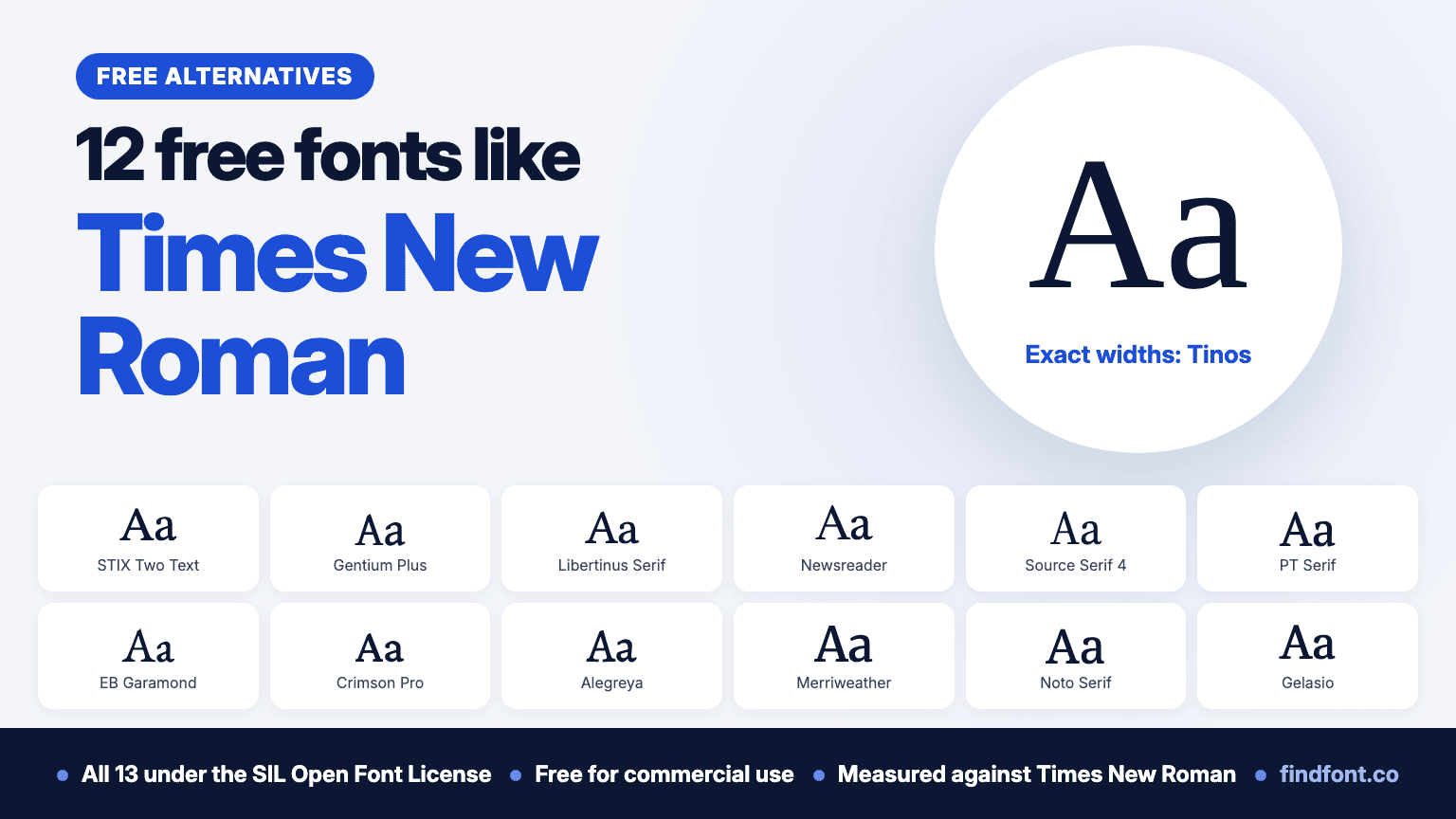
Times New Roman ships with Windows and macOS, but you can't self-host it. Tinos has its exact widths. We measured 12 more free OFL serifs against it.
Times New Roman is on almost every computer. Microsoft describes it as one of the world's most successful type creations, used in books, magazines, reports and office documents.
It started as a newspaper font. The Times of London introduced it in October 1932 (MyFonts). Victor Lardent drew it at The Times under the direction of Stanley Morison, and Monotype's Type Drawing Office refined it. Microsoft says Morison built on experiments with Perpetua and Plantin, keeping many old-style traits while making the type very legible and economical with space (Microsoft). Microsoft has shipped it since Windows 3.1, and Apple lists it among the fonts in macOS Tahoe (Apple).
Monotype still owns Times New Roman. Having it on your computer lets you use it in documents, print and images. It doesn't let you put it on a website you host. Microsoft's font FAQ says you may not copy a Windows font to a web server or convert it to WOFF or WOFF2 (Microsoft font FAQ). Desktop, webfont, app and electronic document licences are sold separately through Monotype's MyFonts store.
So if you want Times New Roman's look on a self-hosted website, in an app or in a template you plan to sell, you need a licence or a free font that can do the same job.
We picked 12 free serif fonts from the findfont catalogue. All of them use the SIL Open Font License, and all of them have bold and italic styles on findfont. We measured how tall each font's lowercase letters are and how wide the same sentence sets, compared with Times New Roman at the same size. The results are in the section called "Which free font is closest to Times New Roman?".
One more font, Tinos, comes first in its own section, because it matches Times New Roman's widths exactly.
One thing to know before you start. Times New Roman is a narrow font with a small x-height. That economy was part of the brief for a newspaper. Its lowercase x measured 0.447 of the font size. Georgia, the other serif that comes with Windows and macOS, set our test sentence 7.7% longer at the same size. Of the 41 free serifs we measured from findfont's catalogue, 32 set the sentence wider than Times New Roman, so expect text to grow a little when you switch.
Need Times New Roman's exact widths? Tinos
Same character widths as Times New Roman, so line breaks don't move
One free font does something none of the 12 below can. Steve Matteson designed Tinos to be metrically compatible with Times New Roman, so that documents keep their layout across platforms (Google Fonts). It used to be licensed under Apache 2.0. In 2026 Google Fonts replaced it with a release under the SIL Open Font License, merged in April and live on the site in May (Google Fonts).
We checked the claim. In the regular, italic, bold and bold italic styles, every printable ASCII and Latin-1 character has exactly Times New Roman's width. Kerned lines came out the same length too, and the line height is identical. Replace Times New Roman with Tinos in an essay, a contract or a template and the lines break in the same places, so the page count doesn't change.
The letters aren't copies of Times New Roman's. Tinos's x-height measured 2.6% taller, so its lowercase looks a touch bigger at the same size. On findfont it comes in Regular and Bold with italics, and it covers Greek, Cyrillic and Hebrew as well as Latin. Times New Roman also covers Arabic, and Tinos doesn't.
Use Tinos for
- Essays and papers formatted in Times New Roman
- Contracts, forms and templates with fixed layouts
- A web fallback that keeps Times New Roman's line lengths
- Documents shared between Word, LibreOffice and other apps
Tinos is licensed under the SIL Open Font License 1.1. Preview and download Tinos.
Verdict. If you're moving existing work off Times New Roman, start with Tinos. If you want a serif with its own character, the 12 fonts below give you more choice.
1. STIX Two Text
Best for academic and scientific papers
STIX stands for Scientific and Technical Information eXchange. The fonts were made for authors and publishers in science, medicine and technology. The project began as a joint effort by the American Mathematical Society, the American Institute of Physics, the American Physical Society, the American Chemical Society, the IEEE and Elsevier. The original STIX fonts were based on Times Roman. STIX Two is a thorough revision of them by Tiro Typeworks, and it still shows that Times ancestry (STIX fonts).
It measured close to Times New Roman. The x-height was 5.8% taller and the test sentence ran 3.9% longer. Matched by x-height, the line lengths were within 2%.
There's a matching STIX Two Math font for equations, and findfont has it too: STIX Two Math. STIX Two Text runs from Regular to Bold with italics.
Use STIX Two Text for
- Journal articles and theses
- Papers with equations
- Scientific, medical and technical publishing
- Reports that used to be set in Times New Roman
STIX Two Text is licensed under the SIL Open Font License 1.1. Preview and download STIX Two Text.
Verdict. STIX Two Text is the scholarly replacement, and it's the closest in spirit to Times New Roman.
2. Gentium Plus
Closest match to Times New Roman's size and line length
Taking size and line length together, Gentium Plus came out closest of the 12. Its x-height was 1.5% taller than Times New Roman's and the same sentence ran 0.8% longer. Swap one for the other at the same size and your lines will be almost the same length.
SIL International makes Gentium, and calls it a Greek font with Latin and Cyrillic (SIL). Gentium Plus covers extended Latin, Cyrillic and Greek, both modern and ancient, which makes it a good fit for languages with many accents and for writing that quotes Greek.
Findfont also has Gentium Book Plus, the same design with a slightly darker weight. It measured 1.5% taller at x-height and 2.7% longer on the test sentence. Both come in Regular and Bold with italics.
Use Gentium Plus for
- Essays and papers
- Multilingual documents
- Linguistics, classics and theology
- Books and long reports
Gentium Plus is licensed under the SIL Open Font License 1.1. Preview and download Gentium Plus. For a darker page, try Gentium Book Plus.
Verdict. Gentium Plus keeps Times New Roman's proportions while looking like a different, gentler font.
3. Libertinus Serif
Best for books and long academic texts
Libertinus began as a fork of Linux Libertine, the free serif designed by Philipp H. Poll. The first aim was to give Libertine a math companion, and the project grew into a full fork that fixes many of the original's bugs (Libertinus). Libertinus Math works in LaTeX engines such as LuaTeX and XeTeX, and in Word 2007 or later.
Libertinus Serif's lines ran 1.7% longer than Times New Roman's, with an x-height 3.6% shorter. It reads a little smaller and a little more bookish.
On findfont it comes in Regular, Semibold and Bold with italics, and it covers Latin, Greek, Cyrillic and Hebrew.
Use Libertinus Serif for
- Theses and dissertations
- Books and long-form PDFs
- LaTeX documents
- Humanities papers
Libertinus Serif is licensed under the SIL Open Font License 1.1. Preview and download Libertinus Serif.
Verdict. Libertinus Serif is the academic's book face, close to Times New Roman's line length with more warmth.
4. Newsreader
Best for news and editorial websites
Times New Roman was drawn for a newspaper. Newsreader, as the name suggests, is made for reading the news on screens. Production Type designed it as an original typeface for continuous on-screen reading in content-rich environments.
Our test sentence set to the same length in Newsreader as in Times New Roman, within 0.1%. Its x-height measured 4.8% shorter, so it looks slightly smaller at the same size.
Newsreader has an optical size axis, from 6 to 72 point. Browsers that support it adjust the letters automatically, sturdier for captions and finer for large headlines. Its weights run from ExtraLight to ExtraBold, with italics.
Use Newsreader for
- News and magazine websites
- Newsletters
- Blogs and long articles
- Editorial headlines
Newsreader is licensed under the SIL Open Font License 1.1. Preview and download Newsreader.
Verdict. Newsreader is the modern version of the job Times New Roman was made for.
5. Source Serif 4
Best for reports and professional documents
Frank Grießhammer designed Source Serif for Adobe as a companion to Source Sans. It's a transitional serif loosely based on the work of the eighteenth-century French typefounder Pierre Simon Fournier, simplified for digital use.
The x-height measured 6.2% taller than Times New Roman's and the test sentence ran 9.5% longer, so documents will grow a little.
Like Newsreader, Source Serif 4 has an optical size axis. Its weights run from ExtraLight to Black, with italics, and it pairs with Source Sans 3 when you need a sans serif for headings or tables.
Use Source Serif 4 for
- Business reports and proposals
- Websites with long text
- Documentation
- Designs that pair a serif with a sans serif
Source Serif 4 is licensed under the SIL Open Font License 1.1. Preview and download Source Serif 4.
Verdict. Source Serif 4 is the polished, corporate-friendly choice.
6. PT Serif
Best for documents in Latin and Cyrillic
ParaType released PT Serif in 2010 for the Public Types of the Russian Federation project, which set out to let people in Russia read and write in their own languages. Alexandra Korolkova, Olga Umpeleva and Vladimir Yefimov designed it. It covers Western and Central European languages and Cyrillic, including every title language of the Russian Federation.
PT Serif is a transitional serif with humanist touches, made to work alongside PT Sans. It looks bigger than Times New Roman, with an x-height 11.8% taller. At about 10.7pt it matches Times New Roman at 12pt, and at that size text runs 2.9% shorter.
On findfont it has Regular and Bold with italics. PT Serif Caption is a version made for small point sizes.
Use PT Serif for
- Documents in Russian, Ukrainian and other Cyrillic languages
- Websites that pair a serif with PT Sans
- Reports and letters
- Small print and footnotes, with PT Serif Caption
PT Serif is licensed under the SIL Open Font License 1.1. Preview and download PT Serif.
Verdict. PT Serif is the dependable pick when your text mixes Latin and Cyrillic.
7. EB Garamond
Best for a classic book look
EB Garamond is a community revival of Claude Garamont's sixteenth-century roman type. Its letters come from a 1592 type specimen printed by Conrad Berner, which shows Garamont's roman alongside Robert Granjon's italic. That's where the name comes from: Egenolff-Berner Garamond. Georg Duffner started the project, and the version on Google Fonts was led by Octavio Pardo.
It's smaller than Times New Roman at the same size. The x-height measured 9.4% shorter and the test sentence ran 5.4% shorter. Set it at about 13pt to look the same size as Times New Roman at 12pt, and lines then run about 4.5% longer.
On findfont it runs from Regular to ExtraBold with italics.
Use EB Garamond for
- Books and novels
- Wedding stationery and invitations
- Literary magazines
- Formal letters
EB Garamond is licensed under the SIL Open Font License 1.1. Preview and download EB Garamond.
Verdict. EB Garamond gives you the classic book page that Times New Roman never quite was.
8. Crimson Pro
Best for textbooks and long reading
Crimson Pro is a Garamond-inspired old-style serif. Its description pitches it at college textbooks, editorial websites and book-length texts. Sebastian Kosch started the first Crimson in 2009, and Google commissioned Jacques Le Bailly to combine Kosch's two versions into Crimson Pro, first released in January 2019.
It's a little smaller than Times New Roman, with an x-height 6.1% shorter and a test sentence 2.6% shorter. Next to EB Garamond it looks more modern and even.
Its weights run from ExtraLight to Black, with italics.
Use Crimson Pro for
- Textbooks and course material
- Long reports and ebooks
- Editorial websites
- Essays that should feel like a book
Crimson Pro is licensed under the SIL Open Font License 1.1. Preview and download Crimson Pro.
Verdict. Crimson Pro is the modern old-style serif for people who read a lot of pages.
9. Alegreya
Best for literature and creative writing
Juan Pablo del Peral designed Alegreya for Huerta Tipográfica as a typeface for literature. Its description talks about a dynamic, varied rhythm that refers to calligraphy without copying it. It was named one of 53 "Fonts of the Decade" at the ATypI Letter2 competition in 2011.
In size it's close to Times New Roman. The x-height measured 2.0% taller and the test sentence ran 0.9% shorter. It looks livelier, though, so nobody will mistake it for Times New Roman.
Its weights run from Regular to Black, with italics. Alegreya SC adds small caps, and there's a sans serif sister, Alegreya Sans.
Use Alegreya for
- Novels and short stories
- Poetry
- Literary websites
- Manuscripts
Alegreya is licensed under the SIL Open Font License 1.1. Preview and download Alegreya.
Verdict. Alegreya keeps Times New Roman's page length and gives the text more personality.
10. Merriweather
Best for reading on screens
Sorkin Type designed Merriweather to be pleasant to read on screens. Its description lists a very large x-height, slightly condensed letterforms, a mild diagonal stress, sturdy serifs and open forms.
That large x-height makes it the biggest font on this list. It measured 24.2% taller than Times New Roman, so Merriweather at about 9.7pt looks the same size as Times New Roman at 12pt. At that size, text runs 4.5% shorter.
Its weights run from Light to Black, with italics. A width axis lets you narrow or widen the letters, and an optical size axis adjusts them for small or large text. Merriweather Sans is its sans serif companion.
Use Merriweather for
- Blogs and long web articles
- Ebooks and reading apps
- Email newsletters
- Small text on screens
Merriweather is licensed under the SIL Open Font License 1.1. Preview and download Merriweather.
Verdict. Merriweather is for screens, and it needs a smaller font size than you're used to.
11. Noto Serif
Best for multilingual projects
Noto is Google's font collection for writing in all modern and ancient languages. Noto Serif covers Latin, Cyrillic and Greek with more than 3,800 glyphs, and dozens of other Noto Serif families add other scripts in a matching style.
Times New Roman covers Latin, Greek, Cyrillic, Hebrew and Arabic in one font. If your documents mix several of those, Noto Serif with Noto Serif Hebrew and Noto Naskh Arabic is the practical free replacement.
It runs large. The x-height measured 19.8% taller and the test sentence 17.7% longer. At about 10pt it matches Times New Roman at 12pt. Its weights run from Thin to Black, with italics, and its width axis goes down to extra-condensed.
Use Noto Serif for
- Multilingual documents and websites
- International organisations
- Translations
- Text in several scripts
Noto Serif is licensed under the SIL Open Font License 1.1. Preview and download Noto Serif.
Verdict. Noto Serif wins when language coverage matters more than an exact visual match.
12. Gelasio
Best if you use Georgia as well
Eben Sorkin designed Gelasio as an original typeface that is metrically compatible with Georgia, the screen serif that Windows and macOS include alongside Times New Roman. Its design was inspired by a printed sample of a French transitional typeface that followed the Romain du Roi of 1702.
We checked that claim too. In all four styles, every printable ASCII character has Georgia's width, apart from a one-unit difference on the bold italic j (out of 2,048 units), and kerned lines came out the same length. Swap Georgia for Gelasio and the lines break in the same places. The line spacing doesn't match, though. At the default spacing, Gelasio's lines sit about 12% further apart than Georgia's, so a page of text runs longer unless you set the line height yourself.
Against Times New Roman, Gelasio measured 8.5% taller at x-height and 7.7% longer on the test sentence, almost exactly like Georgia. On findfont it runs from Regular to Bold with italics.
Use Gelasio for
- Documents and websites set in Georgia
- A web fallback that keeps Georgia's line lengths
- Text that needs a sturdier serif than Times New Roman on screen
- Mixed archives of Times New Roman and Georgia files
Gelasio is licensed under the SIL Open Font License 1.1. Preview and download Gelasio.
Verdict. Gelasio keeps Georgia's line breaks, as Tinos does for Times New Roman. Unlike Tinos, it doesn't keep the line spacing.
Which free font is closest to Times New Roman?
Closest depends on whether you need to keep the line lengths, the size or the feel.
For identical line lengths, choose Tinos.
For the closest size and line length among the 12, choose Gentium Plus.
For academic and scientific papers, choose STIX Two Text.
For books, choose Libertinus Serif or EB Garamond.
For news and editorial sites, choose Newsreader.
For reports and business documents, choose Source Serif 4.
For reading on screens, choose Merriweather.
For many languages, choose Noto Serif.
Our measurements
We measured the Regular weight of each font against Times New Roman Regular, version 5.01, as shipped with macOS. Variable fonts were set to weight 400 with every other axis at its default. We compared the height of the lowercase x and the width of the sentence "The quick brown fox jumps over the lazy dog" at the same font size. The last column compares width again after scaling each font to Times New Roman's x-height, which shows how much text will grow or shrink if you resize the replacement to look the same size.
| Font | x-height vs Times New Roman | Same sentence, same size | Same sentence, x-height matched |
|---|---|---|---|
| Tinos | +2.6% | 0.0% | -2.6% |
| Newsreader | -4.8% | 0.0% | +5.0% |
| Gentium Plus | +1.5% | +0.8% | -0.7% |
| Alegreya | +2.0% | -0.9% | -2.8% |
| Libertinus Serif | -3.6% | +1.7% | +5.5% |
| Crimson Pro | -6.1% | -2.6% | +3.7% |
| STIX Two Text | +5.8% | +3.9% | -1.8% |
| EB Garamond | -9.4% | -5.4% | +4.5% |
| Gelasio | +8.5% | +7.7% | -0.8% |
| PT Serif | +11.8% | +8.6% | -2.9% |
| Source Serif 4 | +6.2% | +9.5% | +3.1% |
| Noto Serif | +19.8% | +17.7% | -1.8% |
| Merriweather | +24.2% | +18.6% | -4.5% |
Measured on 18 October 2026 and checked again on 26 October 2026, with the same results.
Tinos is the only font here with Times New Roman's exact character widths. With any of the other 12, line breaks will move if you swap fonts in an existing document. Newsreader, Gentium Plus and Alegreya changed line length least in our test, all by less than 1%.
Times New Roman versus Georgia
Windows and macOS both come with two classic serif fonts, Times New Roman and Georgia, and people often pick between them.
Matthew Carter designed Georgia for Microsoft, for clarity on low-resolution screens, and Microsoft first released it in September 1996 (Microsoft). Microsoft's own page says Georgia has a friendliness that "many would argue has been eroded from Times New Roman through overuse."
In our measurements Georgia's x-height was 7.6% taller than Times New Roman's and the same sentence ran 7.7% longer. Scaled to the same x-height, the lines came out the same length. In practice, Georgia at about 11pt looks the same size as Times New Roman at 12pt and fills about the same space. APA Style lists the two at exactly those sizes.
Georgia has the same licensing limits. Microsoft doesn't offer it as a download, and the same font FAQ applies to the Windows copy. If you want Georgia's look on a website you host, Gelasio has its widths.
Can these fonts be used commercially?
Yes. Every font in this list is published on findfont under the SIL Open Font License 1.1. In the licence's own words, it lets fonts be "used, studied, modified and redistributed freely as long as they are not sold by themselves" (OFL).
That covers logos, websites, apps, ads, books, packaging and client work. You can self-host the files on your web server and bundle them in software and templates. Two limits apply:
- You can't sell the font files on their own.
- If you modify a font that has a Reserved Font Name, your modified version needs a different name.
Times New Roman is different. The licence text inside the macOS copy lets you display and print content as the product it came with allows, embed it in documents as its embedding settings permit, and send it to a printer. Microsoft's FAQ lets you name Windows fonts in a CSS font stack, so visitors who have Times New Roman installed see it. It does not let you copy the font to a web server, convert it to a web font format or redistribute it (Microsoft font FAQ). For those uses you need a licence from Monotype.
Always check the licence file that comes with any font you download.
How to choose the right Times New Roman alternative
Don't judge a replacement by one word in a big preview. Test it with your real text at your real sizes.
Check whether Times New Roman is required
Schools, journals, courts and publishers sometimes name a font in their rules. If yours does, use the font it names, or ask before you switch.
APA Style doesn't insist on Times New Roman. It permits a variety of fonts, including 12-point Times New Roman, 11-point Georgia and the default font of your word processor. It also recommends word count over page count, because different fonts take up different amounts of space (APA Style).
Decide whether page count matters
If you're replacing Times New Roman in an existing document, such as a contract, a form or a paper with a page limit, width matters as much as looks. Use Tinos, which keeps Times New Roman's widths exactly. Among the 12, Newsreader, Gentium Plus and Alegreya changed line length least.
Match the size, not the number
A font with a taller x-height looks bigger at the same point size. Times New Roman's lowercase is small, so most replacements look bigger at 12pt. Merriweather at about 9.7pt, Noto Serif at about 10pt and PT Serif at about 10.7pt look the same size as Times New Roman at 12pt. EB Garamond needs about 13pt. Resize by eye before you compare.
Check the family
Times New Roman comes with regular, italic, bold and bold italic. All 12 fonts here have bold and italic styles on findfont, so each can replace it across a whole document. If you also write equations, STIX Two Text has STIX Two Math to match.
Compare side by side
Type your own heading and body copy into the findfont compare tool. That link opens seven of the fonts above with the same text. You can compare up to 10 at once.
Final recommendation
If you're replacing Times New Roman in existing documents or templates, use Tinos. It has Times New Roman's widths, so nothing reflows.
For new work, Gentium Plus comes closest to Times New Roman's size and line length, and STIX Two Text is the strongest choice for academic and scientific writing.
Choose Libertinus Serif or EB Garamond for books, Newsreader for news sites, Source Serif 4 for reports, Merriweather for screens and Noto Serif for multilingual text.
The best replacement is the one that keeps your text as easy to read as it was in Times New Roman. Test it with your own words before you decide.
Frequently asked questions
Is Times New Roman free to use?
Times New Roman comes free with Windows and macOS, and you can use it in documents, printed work and images. You can also name it in a website's CSS so visitors who have it installed see it. You can't upload the font files to your own web server, convert them to web font formats or bundle them in an app without a licence from Monotype (Microsoft font FAQ).
What Google font is closest to Times New Roman?
Tinos. It's designed to be metrically compatible with Times New Roman, and in our measurements every printable ASCII and Latin-1 character had Times New Roman's exact width. Of the other fonts on findfont, Gentium Plus came closest on size and line length, within 1.5% on both.
Who designed Times New Roman?
Victor Lardent drew it under the direction of Stanley Morison for The Times of London, and Monotype's Type Drawing Office refined it. The newspaper introduced it in October 1932.
Is there a Times New Roman alternative for LibreOffice or Linux?
Yes. Tinos works in LibreOffice and on Linux like any other installed font. You may also come across Liberation Serif, from the Liberation Fonts project. It aims to give documents the same layout as Times New Roman, shares Tinos's design data and is licensed under the SIL Open Font License (Liberation Fonts). Findfont doesn't carry Liberation Serif, but Tinos does the same job.
Is there a free version of Arial and Courier New too?
Yes, from the same designer. Steve Matteson also drew Arimo, which has Arial's widths, and Cousine, which has Courier New's. Cousine keeps Courier New's columns and line height, but its lowercase is about 25% taller, so it looks bigger at the same size. For Arial, see our guide to free Arial alternatives.
Will replacing Times New Roman change my layout?
Not if you use Tinos, which has Times New Roman's character widths and line height. With the other fonts here, some lines will break in different places. In our measurements, Newsreader, Gentium Plus and Alegreya changed line length by less than 1%.
How do I install these fonts in Word?
Download the font from its findfont page, then install it on your computer. Our guide to installing fonts on Windows, Mac and in Word walks through each step.
More free font alternatives
- Free alternatives to Arial
- Free alternatives to Segoe UI
- Free alternatives to Aptos
- Free alternatives to Gotham
- Free alternatives to Futura
- Free alternatives to Proxima Nova
- Free fonts similar to Helvetica
- Free alternatives to Avenir
- Free fonts similar to SF Pro
Sources
- Microsoft Learn, Times New Roman font family. The Times, 1932, Morison and Lardent, Monotype's Type Drawing Office, Perpetua and Plantin experiments, Windows 3.1.
- MyFonts (Monotype), Times New Roman. October 1932 debut, licence types.
- Font name table of Times New Roman Regular 5.01.4x, as shipped with macOS. Designer credit, Monotype copyright and trademark, embedded licence text.
- Apple Support, Fonts included with macOS Tahoe.
- Microsoft Learn, Font redistribution FAQ for Windows. CSS font stacks, web server and WOFF restrictions.
- Microsoft Learn, Georgia font family. Matthew Carter, screen design, September 1996 release, availability.
- Google Fonts, Tinos. Steve Matteson, metric compatibility with Times New Roman, document portability.
- Tinos project on GitHub. SIL Open Font License 1.1.
- Google Fonts, Replace with OFL release. Tinos 1.340 under the OFL, merged 29 April 2026; the Apache-licensed 1.23 before it.
- STIX fonts on GitHub. Based on Times Roman, STIX Two revision by Tiro Typeworks, SIL Open Font License.
- Libertinus on GitHub. Fork of Linux Libertine, math companion, Word 2007 and later, SIL Open Font License. Google Fonts' metadata for Libertinus Serif names Philipp H. Poll as the designer.
- SIL, Gentium. A Greek font with Latin and Cyrillic, SIL Open Font License.
- Liberation Fonts on GitHub. Layout compatibility with Times New Roman, SIL Open Font License, digitized data from Tinos (licence file).
- APA Style, Font, last updated February 2026. Permitted fonts and sizes, word count over page count.
- SIL, Open Font License official text.
- Free font descriptions: each family's description file in the google/fonts repository.
- Measurements: findfont, 18 October 2026, using fontTools on the font files described above. The Tinos and Gelasio kerning checks used HarfBuzz.